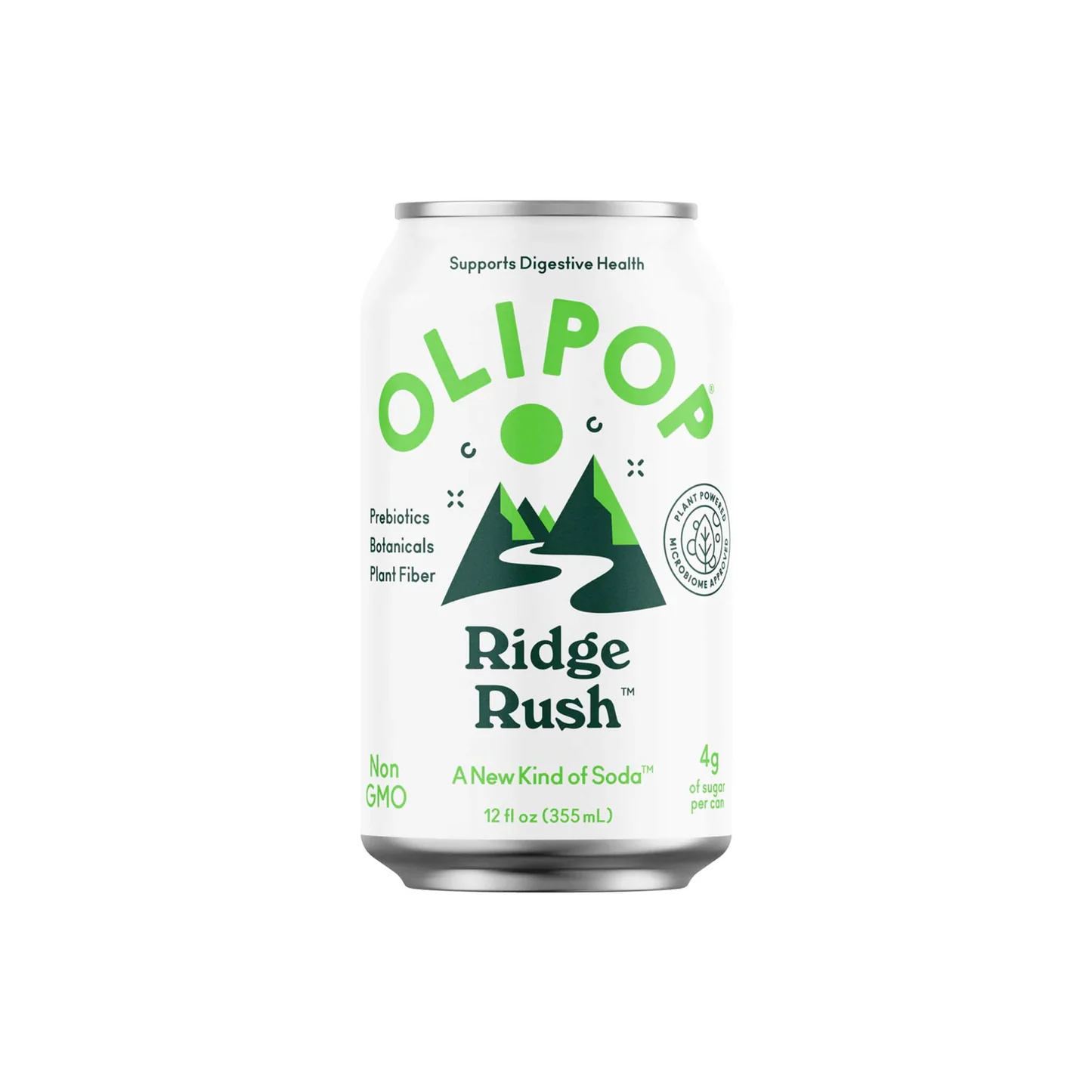
OLIPOP Ridge Rush soda can
A clean, front-facing beverage can uses a bright white field, crisp emerald and deep forest-green graphics, and a centered label hierarchy. The design mixes cheerful curved display lettering with a stout vintage serif wordmark, while a simplified mountain-and-river illustration gives the package an outdoorsy, functional-wellness feel. The layout is symmetrical and airy, with small nutrition claims arranged like badges around the central image, producing a mood that is fresh, approachable, and slightly retro rather than clinical.
Visual index
Form rounded can silhouettebold curved sans letteringchunky vintage serif typographygeometric mountain peakssimple river ribbon icon
Mood freshoutdoorsyfriendly wellnessretro-naturallight and optimistic
Color bright white groundlime green accent typedeep forest green illustrationsoft metallic silver can rimslimited two-green palette
Texture smooth aluminum surfacematte printed label effectcrisp vector illustrationclean studio lightingminimal material noise
Composition centered product presentationstacked vertical label hierarchyarched brand letteringbadge-like side detailslarge negative space
Related images
formal echo
Patagonia outdoor brand minimalism
Patagonia Fitz Roy skyline logo
Look at how the mountains are reduced to blocky silhouettes and how a landscape becomes a compact brand sign rather than a detailed scene.
Shared mountain silhouette emblem, outdoor lifestyle coding, flat graphic reduction, green nature association
Different Patagonia uses a horizontal sunset band, more rugged brand tone, apparel identity rather than beverage packaging
Image search
Patagonia Fitz Roy skyline logo

Wikimedia Commonscultural lineage
WPA National Parks poster language
Works Progress Administration National Park travel posters
Notice the flattened landscape, the strong triangular peaks, and the way nature is organized into a few bold, poster-like shapes.
Shared flattened landscape forms, triangular mountain geometry, idealized wilderness mood, clear graphic hierarchy
Different WPA posters use broader color fields, more pictorial depth, large poster scale
Image search
WPA Yellowstone National Park poster
Ralphstypographic relationship
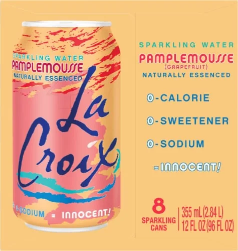
LaCroix expressive can typography
LaCroix Pamplemousse sparkling water can
Focus on the way the brand name becomes the main visual event, using scale, curvature, and color to create shelf impact.
Shared large brand lettering, playful beverage identity, bright white can ground, refreshment-oriented tone
Different LaCroix uses painterly color washes, more chaotic allover surface, less wellness-information hierarchy
Image search
LaCroix Pamplemousse can lettering
Tango Packagingperiod relationship
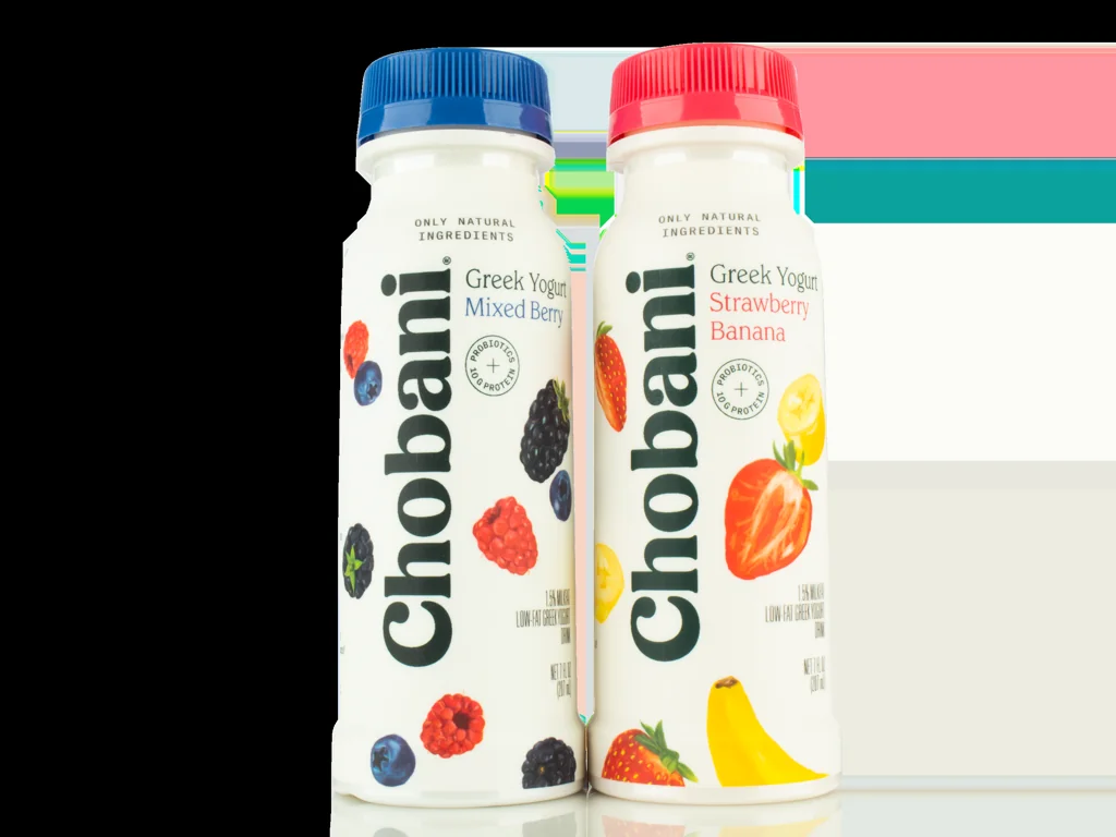
Chobani natural food rebrand warmth
Chobani 2017 packaging rebrand
Compare the soft, friendly serif forms and the way they make a mass-market wellness product feel crafted and trustworthy.
Shared rounded vintage serif, natural-food warmth, clean white packaging, approachable wellness tone
Different Chobani uses creamier palettes, more dairy-category cues, less outdoor iconography
Image search
Chobani 2017 rebrand packaging
compositional relationship
Topo Chico mineral water heritage label
Topo Chico glass bottle label
Look at the centered label structure: brand at the top, product character in the middle, and functional or origin details distributed around it.
Shared centered beverage label, health-adjacent claims, heritage refreshment cues, stacked information zones
Different Topo Chico is more ornate, glass-bottle format, red and yellow accents
Image search
Topo Chico glass bottle label
color relationship
REI Co op outdoors retail identity
REI Co-op evergreen tree logo
Attend to the restrained use of green and black-green as a signal of ecology, activity, and trustworthy outdoor utility.
Shared evergreen color coding, outdoor commercial language, simple nature icon, clean vector edges
Different REI is more utilitarian, monochrome logo system, less playful typography
Image search
REI Co-op evergreen logo