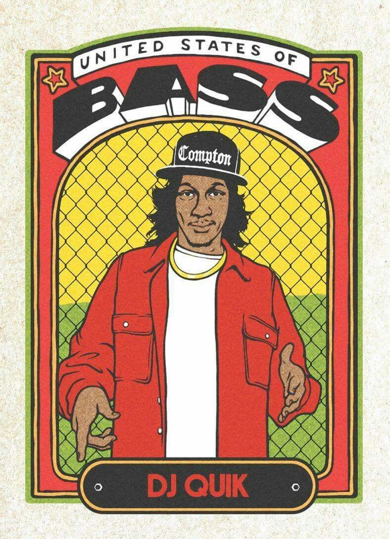
United States of Bass: DJ Quik
A bold trading-card-like portrait built from heavy black outlines, flat saturated color, and a decorative frame. The layout stacks an arched banner, oversized dimensional lettering, a central figure, patterned background mesh, and a bottom nameplate, giving the image the feel of a collectible card, street poster, and comic panel at once. The mood is celebratory and vernacular, with aged-paper grain softening the otherwise bright red, yellow, green, black, and white palette.
Visual index
Form thick contour drawingblocky dimensional letteringbadge-like framingcartoon-realistic portrait stylepatterned chain-link backdrop
Mood celebratorystreetwisenostalgiccollectiblebold
Color primary red and yellowdeep black outlinesgreen border accentscream aged-paper groundhigh-contrast white typography
Texture printed paper grainslight vintage specklingflat ink fillscomic-book linework
Composition central frontal portraitarched top bannerornamental rectangular borderbottom nameplate plaquesymmetrical trading-card layout
Related images
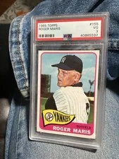
cardboardconnection.comcompositional relationship
Vintage baseball trading card design
1965 Topps baseball cards
Look at how the portrait is locked into a bordered rectangle and how the name area functions like a plaque, turning the figure into a collectible icon rather than a loose illustration.
Shared central figure portrait, bordered card format, bold nameplate, compact vertical hierarchy, collectible-object feel
Different sports photography source, less comic-book linework, more conventional team branding
Image search
1965 Topps baseball card portrait nameplate border
formal echo
Lotería card vernacular
Don Clemente Gallo Lotería game cards
Notice the frontal emblem-like figure, black contour lines, flat fills, and the way the bottom label anchors the image as a named type or persona.
Shared single emblematic figure, flat saturated color, black outline drawing, bottom title label, decorative card border
Different folk-game context, simpler figure rendering, less hip-hop typography
Image search
Don Clemente La Dama Loteria card border label illustration

collectors.comcultural lineage
Hip hop trading card ephemera
Yo! MTV Raps trading cards by Pro Set, early 1990s
Look for the fusion of music fandom and sports-card format: artist portrait, bold identity text, and a design meant to circulate as pop-culture memorabilia.
Shared hip-hop portrait format, collectible card logic, artist name emphasis, bright commercial palette, fan-object presentation
Different often photographic portraits, more 1990s commercial layout, less hand-drawn texture
Image search
1991 Pro Set Yo MTV Raps trading cards hip hop artist portraits
medium reference
Garbage Pail Kids comic card printing
Garbage Pail Kids cards illustrated by John Pound for Topps
Attend to the assertive black outlines, simplified shading, and slightly gritty print feel that make the image read as mass-produced card art rather than polished digital illustration.
Shared thick black contours, bright flat color, card-scale illustration, printed-paper texture, comic exaggeration
Different gross-out satire, child-character caricature, more grotesque modeling
Image search
John Pound Garbage Pail Kids original Topps card art thick black outlines
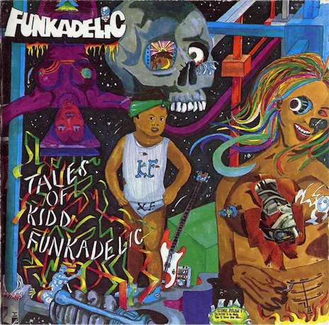
dangerousminds.netcultural lineage
Pedro Bell funk comix album graphics
Funkadelic album artwork by Pedro Bell, especially Uncle Jam Wants You
Notice the music-poster energy: lettering as image, bright chromatic contrast, and a comic sensibility that treats the performer as both character and logo.
Shared music identity graphics, comic-book drawing language, bold hand-shaped lettering, saturated poster palette, performer-as-icon framing
Different more psychedelic density, busier surreal imagery, less trading-card structure
Image search
Funkadelic Uncle Jam Wants You Pedro Bell album cover artwork
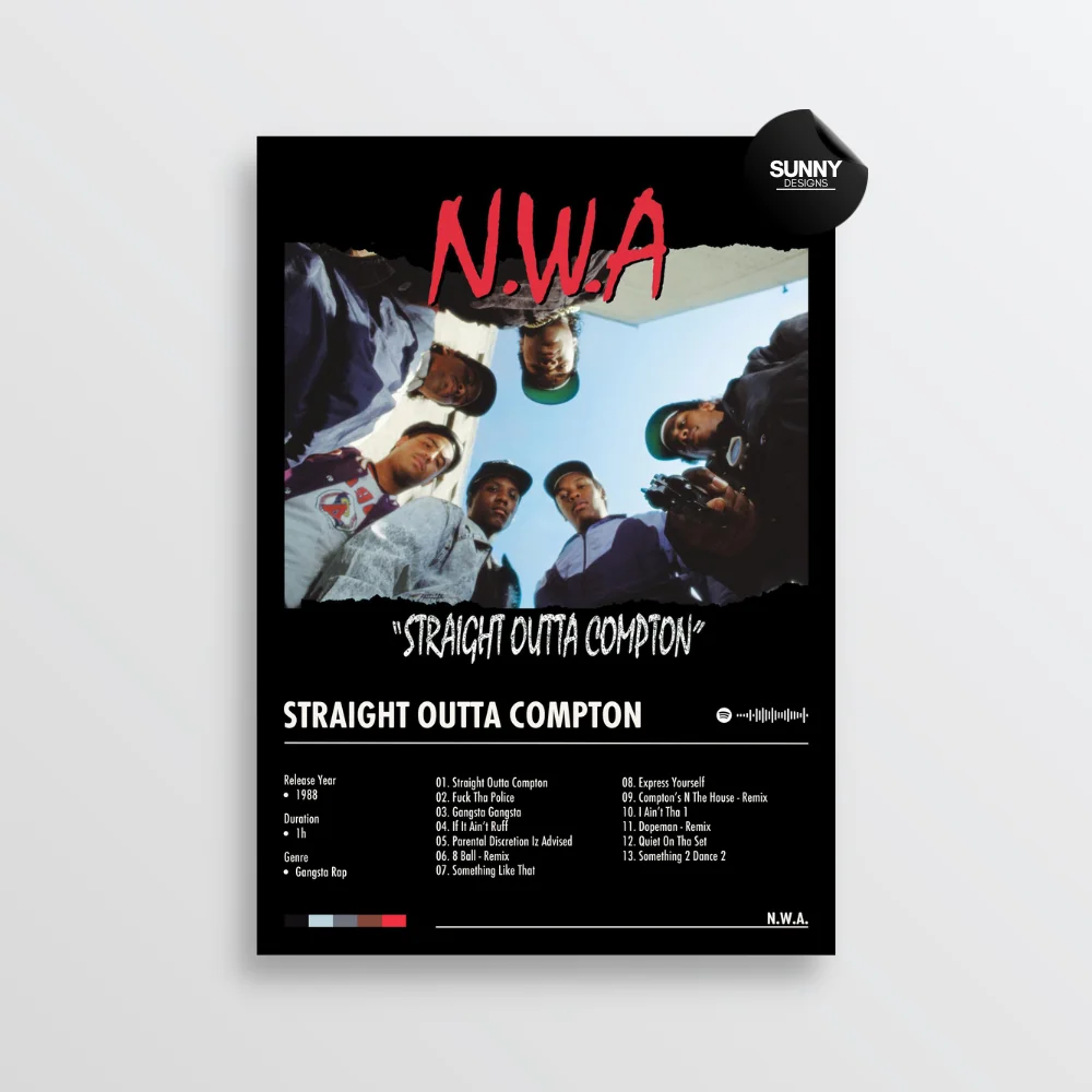
sunnydesignsposters.nltypographic relationship
West Coast rap graphic identity
N.W.A Straight Outta Compton album-cover and logo-era graphics
Focus on the weight of the lettering and the identity-building role of place names; typography works less as caption and more as territorial branding.
Shared Compton place-branding, black-white-red contrast, bold sans-serif impact, streetwear identity cues, music-culture emblem
Different photographic cover language, more austere layout, less decorative border work
Image search
NWA Straight Outta Compton album cover logo typography
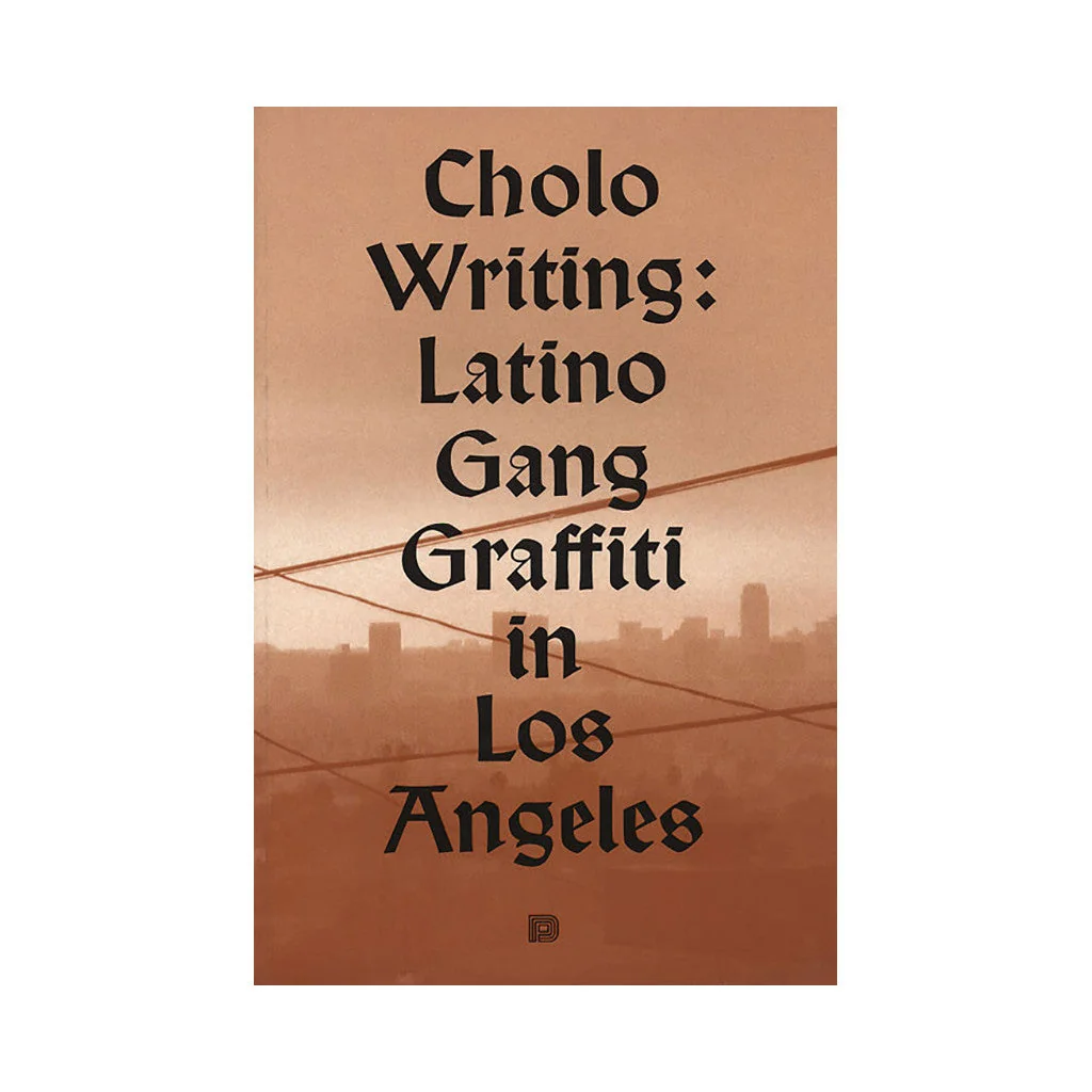
shopify.undergroundhiphop.comtypographic relationship
Chicano blackletter and placa writing
Chaz Bojórquez cholo writing and blackletter-influenced Los Angeles graffiti
Look at the compressed vertical strokes, ornamental letter terminals, and the way a single word on clothing becomes a location marker and cultural signal.
Shared Old English letterforms, Southern California street identity, place-name typography, black-and-white cap lettering
Different calligraphic wall-writing medium, more gestural lettering, less cartoon portrait framing
Image search
Chaz Bojorquez cholo writing blackletter graffiti Los Angeles