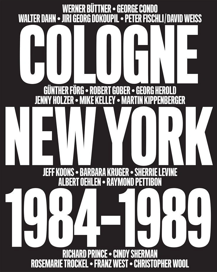
Cologne New York 1984–1989 exhibition graphic
A stark typographic composition built from oversized, condensed white sans-serif lettering on a nearly black field. The layout turns names, place names, and dates into architectural blocks: massive title words dominate the center while smaller artist lines act like horizontal bands and separators. The visual feel is blunt, urban, promotional, and exhibition-like, with little ornament beyond scale contrast, tight leading, and compressed letterforms.
Visual index
Form condensed sans-serif typeoverscaled block lettersall-caps typographytight kerningtext as structure
Mood assertiveinstitutionalurbancompresseddeclarative
Color black-and-white palettehigh contrastflat ink-like fieldsabsence of midtones
Texture smooth printed surfacehard-edged letterformsmatte graphic flatnessno illustrative texture
Composition centered stacked typographymonumental title hierarchydense vertical packinghorizontal name bandsposter-like rectangular framing
Related images
publicdelivery.orgtypographic relationship
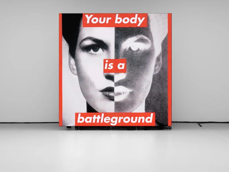
Barbara Kruger s declarative text image graphics
Barbara Kruger, Untitled (Your body is a battleground), 1989
Look at how scale, bold sans-serif letters, and tight rectangular alignment make text function less like captioning and more like visual authority.
Shared bold all-caps type, high-contrast text field, poster-like directness, graphic compression
Different red accent bars, photographic portrait layer, political slogan structure
Image search
Barbara Kruger body battleground poster
MoMAcompositional relationship
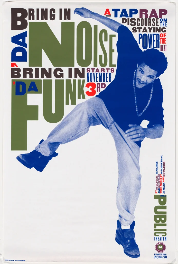
Paula Scher s Public Theater typography
Paula Scher, The Public Theater Bring in 'da Noise, Bring in 'da Funk poster, 1995
Attend to the way varied type scale creates movement and hierarchy while keeping the entire surface dominated by words.
Shared stacked word blocks, oversized typographic hierarchy, urban poster energy, dense information field
Different more varied type sizes, warmer color accents, more kinetic diagonals
Image search
Paula Scher Public Theater Noise poster
formal echo
Christopher Wool s word paintings
Christopher Wool, Apocalypse Now, 1988
Notice how compressed letters become almost sculptural shapes, with reading and looking competing for attention.
Shared monumental block text, black-and-white severity, compressed lettering, language as image
Different stenciled hand-made edges, white ground instead of black ground, fragmented phrase rather than poster information
Image search
Christopher Wool Apocalypse Now painting
MoMAtypographic relationship
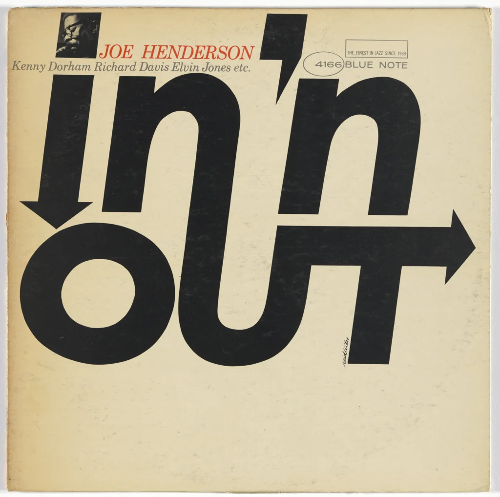
Reid Miles Blue Note typographic covers
Reid Miles, Blue Note Records album-cover typography, especially late-1950s and 1960s covers
Look for the disciplined balance between readable information and abstract blocks of letterform, especially in condensed sans-serif arrangements.
Shared modern sans-serif emphasis, strong typographic hierarchy, graphic use of negative space, music-poster directness
Different photographic jazz imagery, more asymmetrical layouts, frequent color overlays
Image search
Reid Miles Blue Note typography cover
testpressing.orgperiod relationship
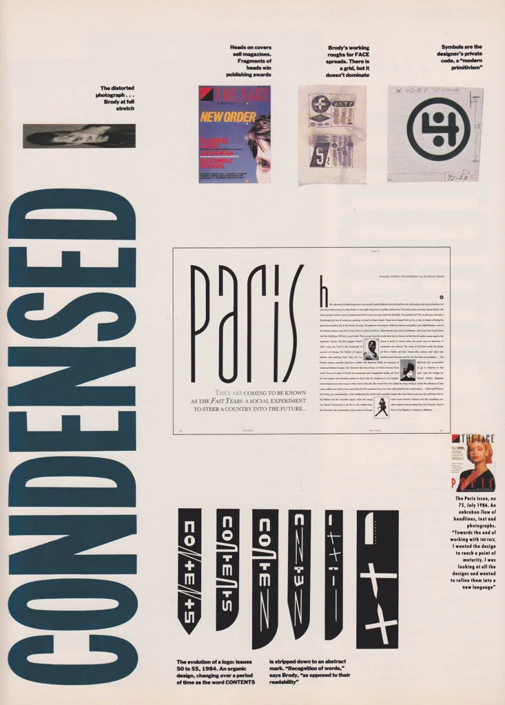
Neville Brody s 1980s editorial typography
Neville Brody, The Face magazine covers and layouts, early 1980s
Notice the 1980s taste for type as attitude: compressed forms, loud hierarchy, and layouts that feel like cultural posters rather than neutral information.
Shared 1980s graphic assertiveness, condensed letterforms, dense editorial surface, type-led identity
Different experimental custom fonts, photographic fashion imagery, more color and asymmetry
Image search
Neville Brody The Face typography
mantex.co.ukcultural lineage
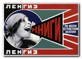
Russian Constructivist propaganda typography
Alexander Rodchenko, Books! In All Branches of Knowledge poster, 1924
Compare how bold letterforms organize the page into emphatic public communication rather than decorative lettering.
Shared public-address typography, bold geometric lettering, high graphic contrast, poster as proclamation
Different diagonal Constructivist structure, photomontage figure, red-black color system
Image search
Rodchenko Books poster typography
contrast reference
International Typographic Style exhibition posters
Josef Müller-Brockmann, Musica Viva concert posters, 1950s
Use the reference to see what this image intensifies: Swiss clarity is present, but the uploaded poster removes most white space and turns order into pressure.
Shared sans-serif discipline, structured hierarchy, grid-based alignment, institutional poster format
Different more white space, asymmetrical modernist balance, less aggressive scale compression
Image search
Muller Brockmann Musica Viva poster