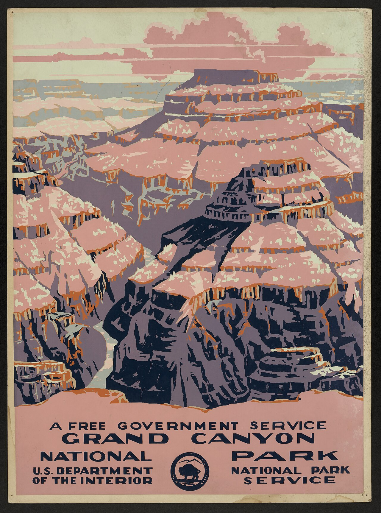
Pastel WPA Landscape Poster with Block-Printed Canyon Forms
The image has the feel of a 1930s American public-service travel poster: a monumental landscape reduced into broad, carved planes of salmon pink, mauve, slate blue, cream, and rust. The composition stacks terraces and shadows into a deep vertical vista, with a large illustration field above a structured typographic footer. Texture comes from uneven ink coverage, speckled paper wear, slight misregistration, and stencil-like color separations, giving the poster a handmade screenprint or lithographic character. The mood is civic, optimistic, and promotional, but softened by faded pastel tones and aged paper. Forms are simplified into angular strata, dark ravines, and posterized highlights rather than naturalistic detail.
Visual index
Form posterized landscape planesblocky canyon silhouettescarved shadow massessimplified cloud bandsbold geometric lettering
Mood civic optimismnostalgic public-service promotionmonumental but approachablesun-faded warmth
Color dusty salmon pinkmauve and lavender shadow tonesslate navy and blue-graycream highlightssmall rust-orange accents
Texture flat ink fieldsspeckled surface wearrough-edged color separationsscreenprint-like registrationweathered poster paper
Composition vertical travel-poster layoutlarge scenic image over typographic footerstacked geological bandsdeep central ravine leading the eye upwardframed by an aged paper border
Related images

Wikimedia Commonscultural lineage
WPA Federal Art Project national park posters
WPA National Park Service poster, “Grand Canyon National Park,” c. 1938
Look at how the landscape is turned into a small number of flat color plates, with the bottom portion reserved for institutional text and a government seal.
Shared public-service travel promotion, limited flat color palette, large scenic image above text block, bold all-caps lettering, screenprint-like simplification
Different reference may appear in cleaner reproductions, some versions have stronger color saturation
Image search
WPA Grand Canyon National Park A Free Government Service poster 1938

Wikimedia Commonsperiod relationship
WPA See America travel poster campaign
Federal Art Project “See America” posters for U.S. travel and tourism, 1930s
Notice the clear division between attraction image and message, the civic tone, and the way modernist simplification makes the landscape readable from a distance.
Shared New Deal-era public graphics, tourism as civic messaging, simplified natural forms, large readable type, optimistic promotional tone
Different many See America posters use brighter primaries, some feature cities or workers rather than wilderness
Image search
WPA See America posters Federal Art Project national parks

elpalacio.orgmaterial kinship
American color woodcut landscape
Gustave Baumann Southwestern color woodcuts, especially his New Mexico and canyon landscapes
Focus on the jagged contour lines, separated color blocks, and the way highlights sit on top of darker masses like printed layers rather than blended paint.
Shared carved contour edges, layered ink colors, Southwestern earth palette, decorative landscape flattening, handmade print texture
Different Baumann prints are usually smaller fine-art objects, woodcuts often show more visible grain, less institutional typography
Image search
Gustave Baumann New Mexico canyon color woodcut landscape

Wikimedia Commonsmedium reference
Japanese shin hanga landscape printmaking
Hiroshi Yoshida, “Grand Canyon,” from his American landscape woodblock prints, 1920s
Compare the stepped recession of forms, the use of pale sky and cloud bands, and the separation of rock faces into distinct tonal zones.
Shared layered landscape depth, flat printed color areas, soft atmospheric palette, stylized canyon geometry
Different Yoshida is more delicate and naturalistic, no typographic footer in the print, finer linework and subtler gradients
Image search
Hiroshi Yoshida Grand Canyon woodblock print

enchantedarchives.comcompositional relationship
European modern travel poster design
Emil Cardinaux, “Zermatt Matterhorn” travel poster, 1908
Look for the large landform dominating the page, the reduced palette, and the way the poster favors immediate recognition over scenic detail.
Shared monumental landscape icon, simplified mountain forms, travel-poster hierarchy, flat color construction, destination branding
Different Cardinaux uses a more vertical alpine silhouette, stronger Art Nouveau-to-modern transition, less government-service language
Image search
Emil Cardinaux Zermatt Matterhorn 1908 travel poster

travelpostersonline.comformal echo
British railway poster modernism
Tom Purvis, LNER “East Coast Joys” poster, 1931
Notice how Purvis reduces complex visual information into large interlocking shapes and uses bold lettering to make the poster legible in public space.
Shared flat poster color, mass-market travel promotion, simplified silhouettes, strong image-text hierarchy, modern graphic economy
Different figure-centered beach imagery, brighter commercial leisure tone, cleaner hard-edge geometry
Image search
Tom Purvis LNER East Coast Joys 1931 poster