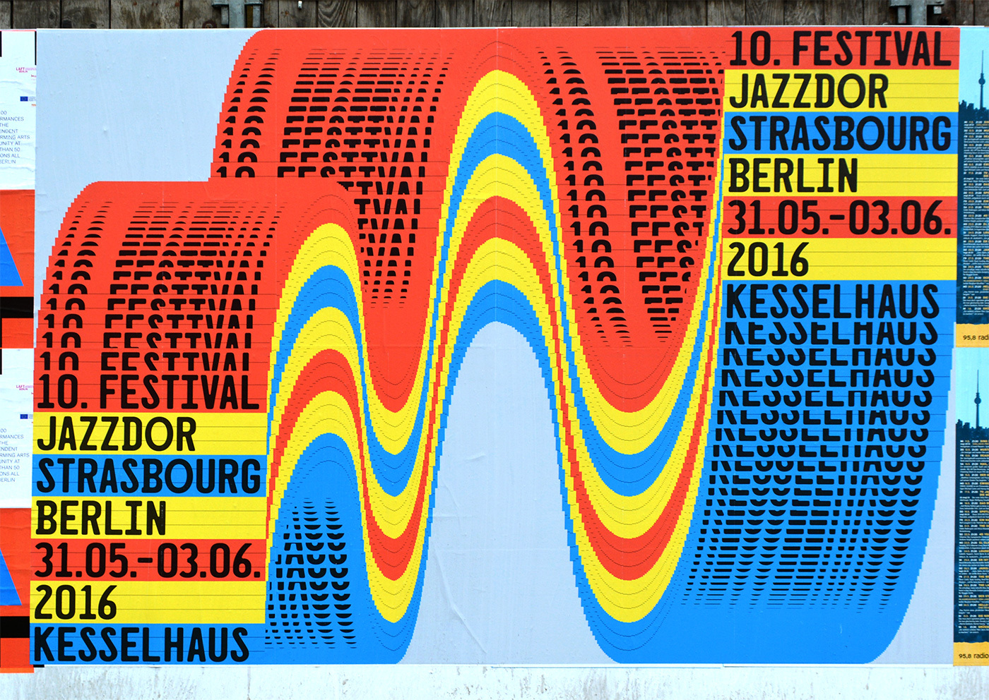
10. Festival Jazzdor Strasbourg Berlin 2016 poster
A large street-pasted festival poster built from high-key cyan, yellow, red, and black, with a pale blue ground and dense optical waveforms that swell across the surface like sound made visible. The composition is split between rigid stacked information blocks and a central rolling ribbon of repeated marks, creating tension between typographic order and vibrating motion. Its texture comes from printed-paper seams, slight wrinkles, and the moiré-like dot-and-dash patterning, giving the otherwise flat graphic system a public-poster tactility.
Visual index
Form wave arcscompressed sans-serif letteringoptical bulgesmodular dash gridsposterized graphic bands
Mood energeticloudurbanrhythmicfestival-like
Color saturated red, yellow, cyan, and blackpale sky-blue backgroundprimary-color poster palettehigh contrast color blockingscreenprint-like layering
Texture pasted paper wrinkleshalftone-like repetitionmoire vibrationflat ink coveragestreet poster seams
Composition oversized horizontal poster formatstacked typographic information panelscentral undulating waveformrepeated modular marksasymmetrical balance between image and text
Related images
MyArtBrokerformal echo
Op Art vibration
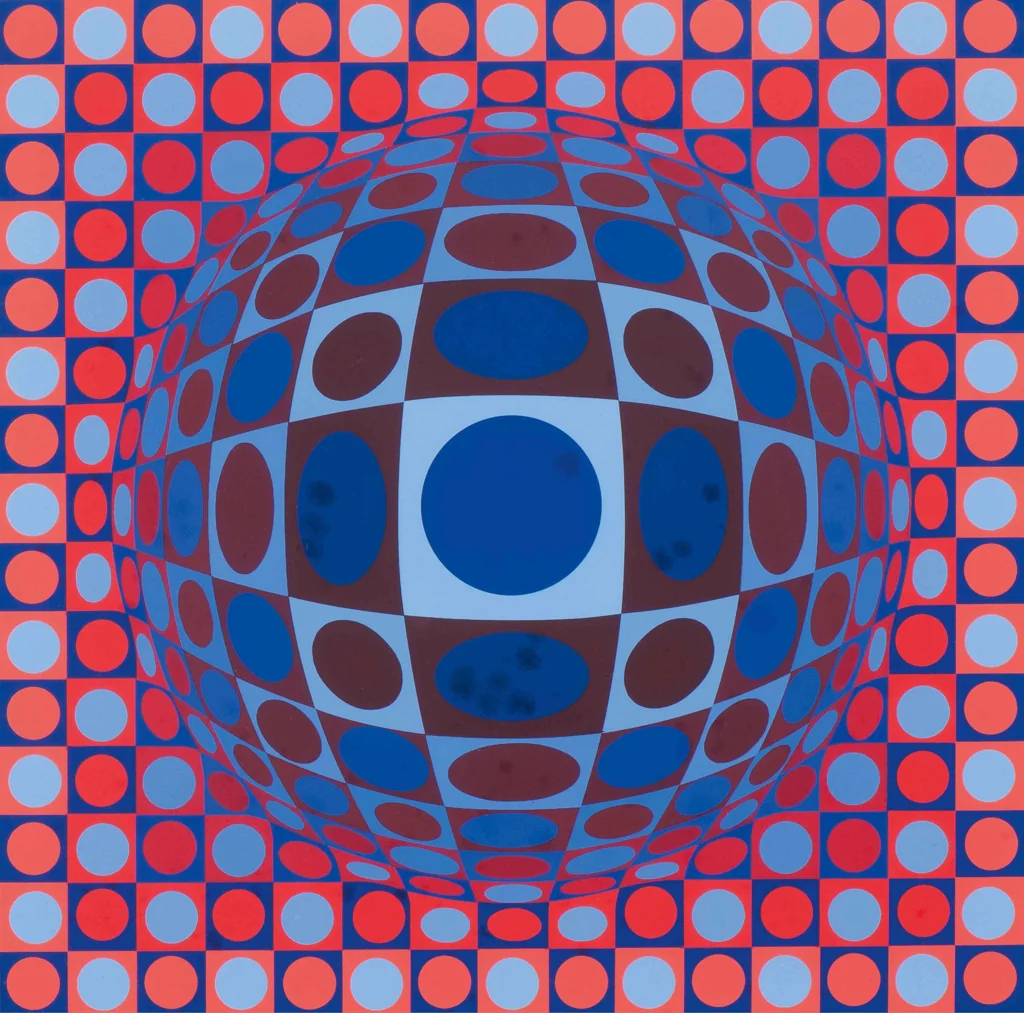
Victor Vasarely, Vega series
Look at how small repeated units bend around an implied volume, making a flat surface appear to bulge, ripple, or recede.
Shared modular repeated marks, optical distortion, bulging spatial illusion, high-contrast pattern fields
Different Vasarely is more geometric and self-contained, less event-information typography, more illusionistic depth
Image search
Victor Vasarely Vega blue red
Singulartcolor relationship
Chromatic stripe Op Art
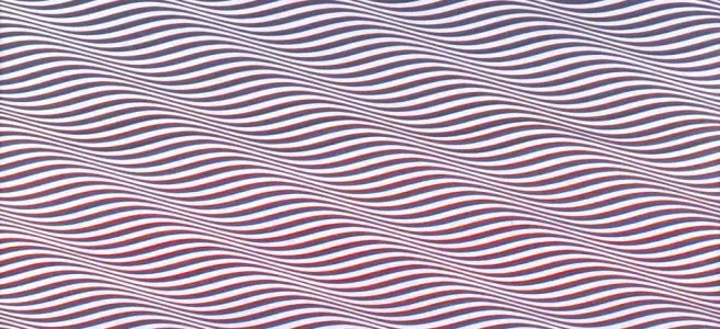
Bridget Riley, Cataract 3
Attend to the way adjacent saturated colors seem to pulse at their borders, especially where curved stripes compress and expand.
Shared curving color bands, retinal vibration, rhythmic repetition, saturated optical color
Different Riley is non-typographic, more refined painterly spacing, less urban-poster texture
Image search
Bridget Riley Cataract 3 color
Wikimedia Commonscultural lineage
Swiss concert poster modernism
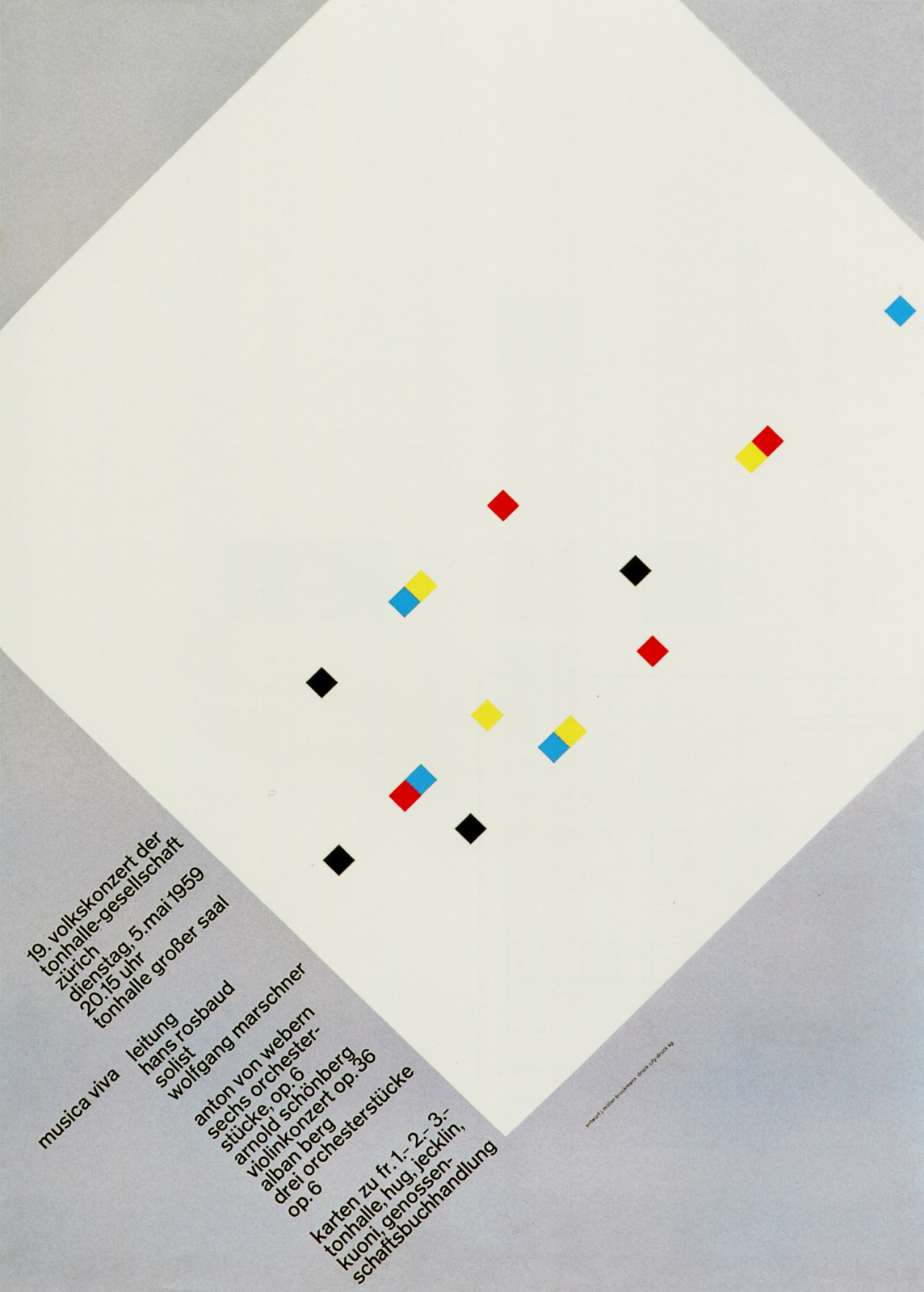
Josef Müller-Brockmann, Musica viva concert posters
Notice how musical information is translated into arcs, repeated forms, and disciplined typographic hierarchy rather than illustration of performers.
Shared music-as-geometry concept, strong typographic hierarchy, abstract rhythmic forms, poster clarity from distance
Different Swiss palette is usually more restrained, cleaner grid discipline, less psychedelic distortion
Image search
Müller Brockmann Musica Viva poster
garadinervi-repertori.blogtypographic relationship
Dutch modernist typographic systems
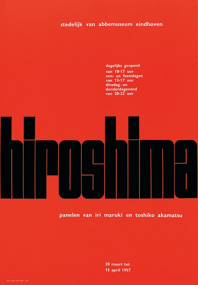
Wim Crouwel, Hiroshima poster for Stedelijk Museum
Focus on the mechanical feeling of the letterforms, the strict alignment, and the way text becomes a graphic texture as much as readable information.
Shared modular sans-serif type, systematic layout, text as visual texture, bold information hierarchy
Different Crouwel is more grid-rational, less saturated primary color, less organic waveform motion
Image search
Wim Crouwel Hiroshima Stedelijk poster
MoMAperiod relationship
New Wave Swiss typography
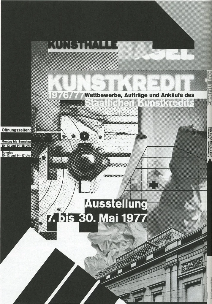
Wolfgang Weingart, Kunstkredit Basel posters
Look for the shift from pure grid clarity to typographic density: letters become blocks, rhythms, and disruptions across the composition.
Shared dense typographic repetition, grid under pressure, bold black sans-serif text, poster surface energy
Different Weingart often uses more fragmented collage, less bright pop color, more photographic or process-based layering
Image search
Wolfgang Weingart Kunstkredit Basel
1stdibs.commedium reference
Screenprint poster color culture
Sister Corita Kent, 1960s serigraph prints
Observe how flat, saturated ink fields and oversized words create an immediate public voice, closer to street graphics than quiet fine-art composition.
Shared flat saturated ink, large declarative typography, public-facing graphic energy, bright color blocks
Different Corita’s forms are more hand-cut and lyrical, more slogan-driven text, less optical waveform structure
Image search
Corita Kent serigraph bold text