
Happy Mac icon
A stark black-and-white bitmap-style icon built from thick rectilinear strokes and stepped corners. The composition is centered and frontal, with a compact smiling face nested inside a simplified computer body. Its feel is friendly but highly reduced: a digital pictogram where personality emerges from a few square marks, rigid symmetry, and early-screen pixel logic.
Visual index
Form rectilinear geometrythick outline drawingmodular pixel unitssimplified pictogramanthropomorphic machine face
Mood friendlyminimalnostalgicapproachableearly personal-computing optimism
Color black and whitehigh contrastabsence of shadingmonochrome interface palette
Texture crisp bitmap edgespixelated stair-step contoursflat digital filllow-resolution screen-era mark making
Composition centered frontal viewnested rectanglesiconic silhouettebalanced asymmetry in face detailslarge white negative space
Related images
Wikimedia Commonsmedium reference
Xerox Star desktop icon system
Xerox Star 8010 graphical user interface icons, early 1980s
Look at how the icons use thick outlines, simplified silhouettes, and strong interior negative space so they remain legible on low-resolution displays.
Shared black-and-white screen graphics, low-resolution pictogram logic, thick linear outlines, functional icon clarity
Different more utilitarian tone, less anthropomorphic charm, broader office metaphor system
Image search
Xerox Star 8010 desktop icons
Redditformal echo
Otl Aicher pictogram modernism
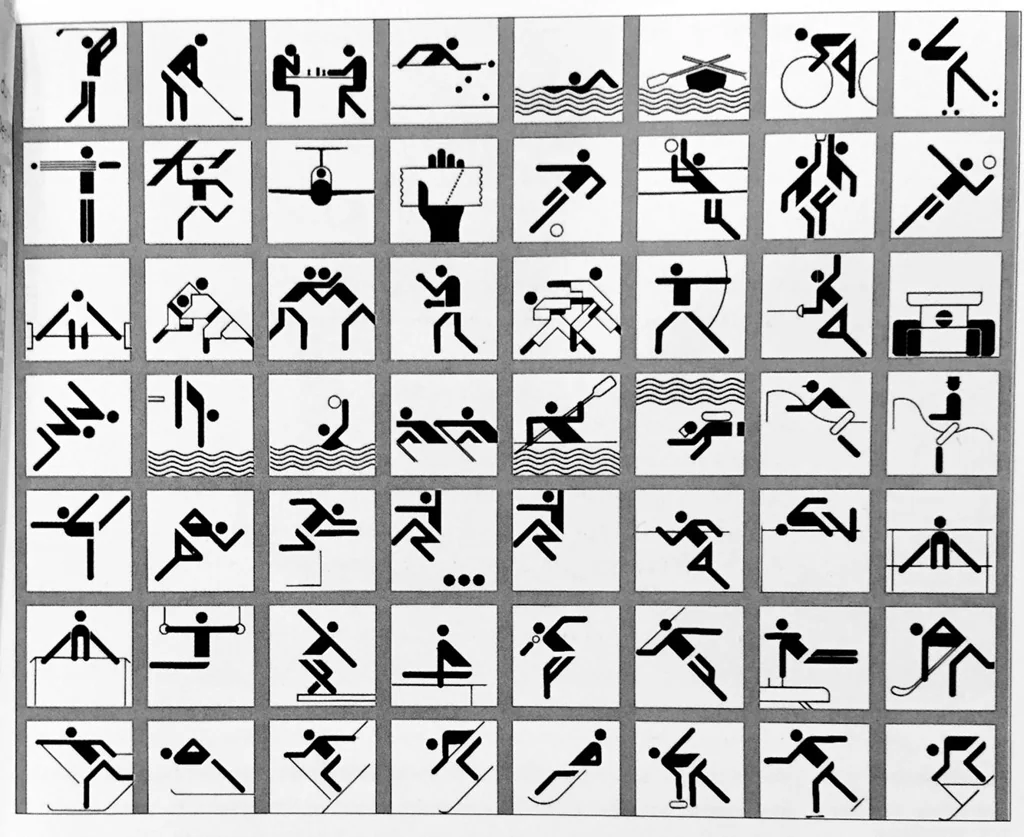
Otl Aicher, Munich 1972 Olympic pictograms
Attend to the modular geometry, standardized line weight, and the way personality or motion is implied through a small number of controlled marks.
Shared geometric reduction, clear silhouette, systematic visual language, high legibility
Different diagonal human motion, international signage context, less pixel-specific construction
Image search
Otl Aicher Munich pictograms
Redditperiod relationship
Taito arcade pixel character design
Space Invaders alien sprites, Taito, 1978
Notice how stepped contours and square units turn technical limitation into a distinctive visual style rather than a defect.
Shared block-based construction, stepped pixel contours, minimal facial character, early digital nostalgia
Different game sprite context, more decorative symmetry, animated enemy character role
Image search
Taito Space Invaders alien sprite
Quartzcompositional relationship
Paul Rand corporate mark geometry
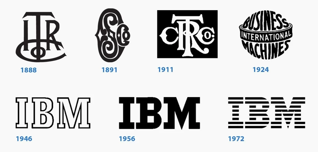
Paul Rand, IBM striped logo, 1972
Compare the disciplined weight of the black elements and the reliance on positive-negative rhythm rather than illustrative detail.
Shared bold black geometry, reduction to essentials, strong visual identity, flat graphic authority
Different typographic wordmark, horizontal stripe rhythm, corporate branding rather than interface icon
Image search
Paul Rand IBM striped logo
osxdaily.comcultural lineage
Apple Finder face icon
Classic Mac OS Finder face icon, Apple interface design
Focus on the split face, minimal eyes, and simple line economy: the interface becomes a character rather than a neutral machine panel.
Shared friendly computer persona, minimal facial marks, black-and-white interface heritage, simple geometric expression
Different two-tone divided face, more abstract head shape, later desktop navigation role
Image search
classic Mac OS Finder face
color relationship
Nintendo Game Boy screen graphics
Nintendo Game Boy monochrome interface and sprite graphics, 1989
Look for how monochrome contrast and chunky pixel geometry create immediate readability without gradients or nuanced contouring.
Shared monochrome display logic, pixel-grid construction, simple expressive forms, nostalgic digital flatness
Different greenish LCD palette, gameplay animation context, smaller sprite scale
Image search
Nintendo Game Boy Tetris sprites