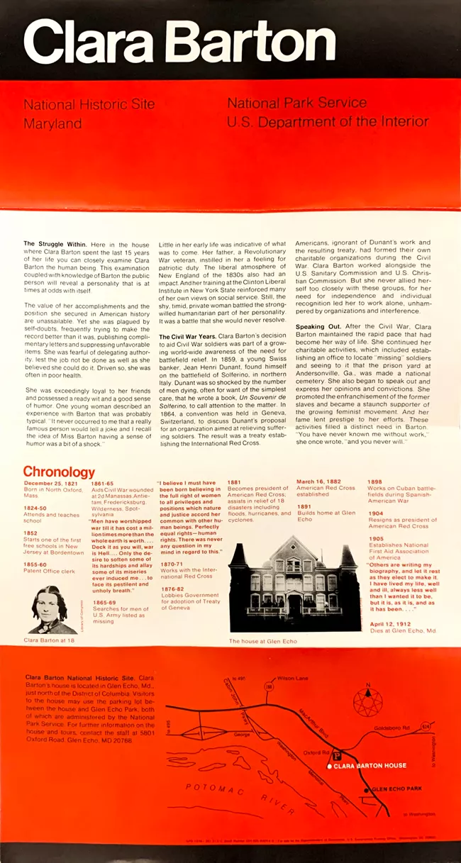
Federal modernist interpretive panel with high-contrast bands
The image has the feel of a mid-to-late 20th-century public-information panel: a bold black masthead, saturated red-orange section bands, off-white reading field, and tightly organized multi-column text. Its visual force comes less from imagery than from hierarchy, grid, and institutional clarity. The layout combines Swiss-style sans-serif typography, documentary inserts, a small chronology block, and a schematic map, producing a civic, educational mood that is authoritative, economical, and highly structured.
Visual index
Form rectangular panel formatHelvetica-like sans-serif typehard-edged color blocksdiagrammatic map linesdocumentary layout logic
Mood institutionaleducationalcommemorativeorderlypublic-service oriented
Color black mastheadsaturated red-orange bandswarm off-white information fieldsmall grayscale photographic elementslow-contrast dark red secondary text
Texture printed interpretive signage surfaceslight gloss and glareflat color fieldsfine typographic texturearchival photo grain
Composition stacked horizontal zoneslarge title block at topmodular griddense multi-column body copybottom map stripsmall image-and-caption inserts
Related images
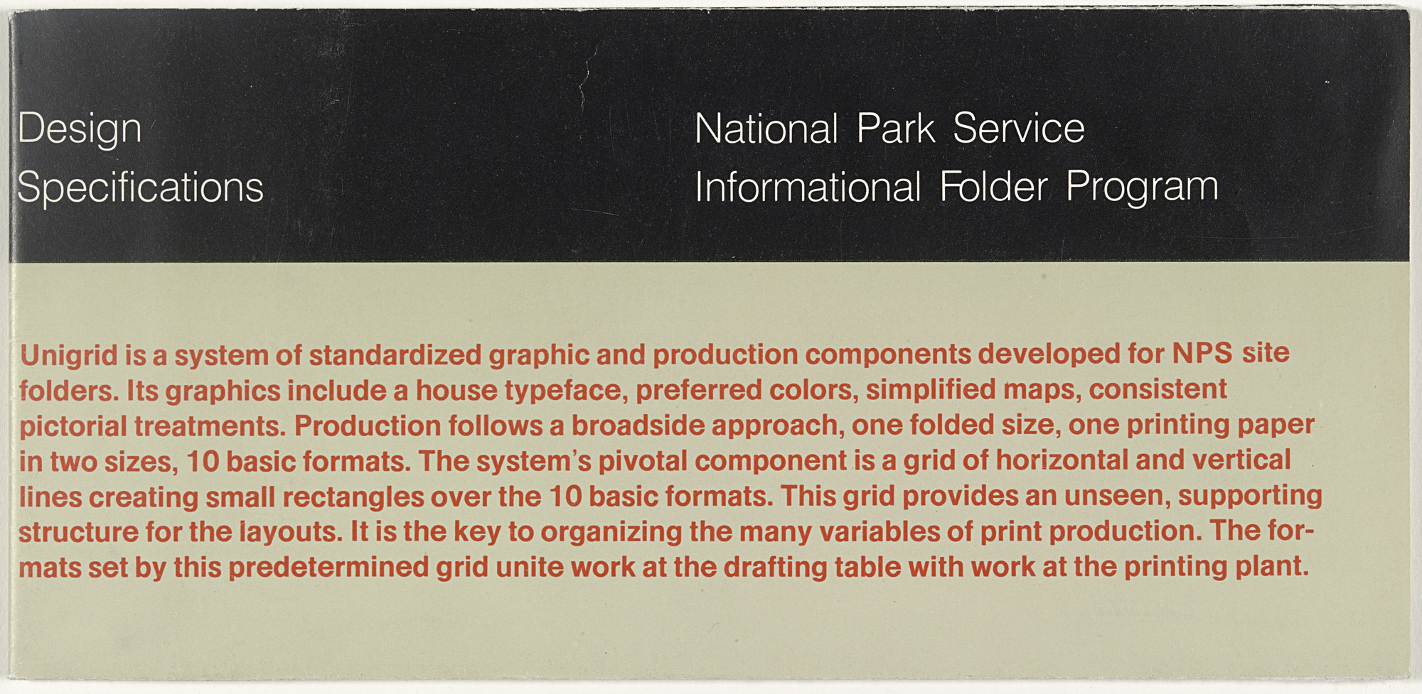
moma.orgcultural lineage
National Park Service Unigrid system
Massimo Vignelli Associates, National Park Service Unigrid brochure system, introduced in the late 1970s
Look at how headings, body copy, captions, maps, and small images are locked into a rational grid rather than arranged pictorially. The authority comes from repeatable structure.
Shared federal information design, modular grid, sans-serif hierarchy, map plus text integration, institutional clarity
Different brochure fold logic, more portable format, often uses landscape photography
Image search
Massimo Vignelli National Park Service Unigrid brochure grid examples

neugraphic.comformal echo
International Typographic Style
Josef Müller-Brockmann, Zurich Tonhalle and Musica Viva concert posters, 1950s–1960s
Focus on the invisible grid: text blocks align precisely, scale establishes importance, and color is used as a system rather than decoration.
Shared grid-based alignment, sans-serif typography, asymmetric organization, economical color use, structured hierarchy
Different more expressive abstract geometry, less body text density, cultural-poster context
Image search
Josef Müller-Brockmann Musica Viva concert poster 1958
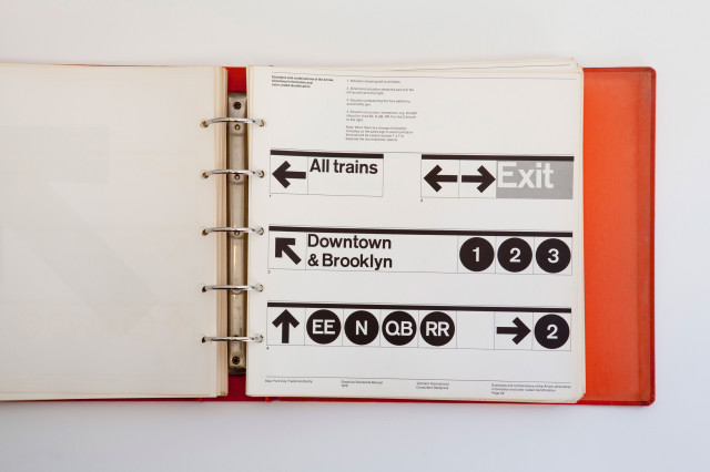
laughingsquid.comtypographic relationship
New York City Transit Authority modernist standards
Massimo Vignelli and Bob Noorda, New York City Transit Authority Graphics Standards Manual, 1970
Compare the blunt sans-serif letterforms, the use of black fields for authority, and the way secondary information is subordinated through smaller type and alignment.
Shared Helvetica-like type, public information tone, black field emphasis, clear hierarchy, systematic layout
Different wayfinding rather than interpretation, icon-heavy transit context, less narrative text
Image search
New York City Transit Authority Graphics Standards Manual 1970 Helvetica black sign pages
period relationship
Bauhaus functional typography
Herbert Bayer, Bauhaus Dessau typographic experiments and exhibition graphics, 1920s
Notice the reduction of ornament, the reliance on type as architecture, and the way red is used to activate a strict informational composition.
Shared red-black-white contrast, functional sans-serif type, geometric layout logic, minimal ornament
Different more experimental letter spacing, more avant-garde composition, less institutional density
Image search
Herbert Bayer Bauhaus exhibition typography red black white poster
cultural lineage
Federal Design Improvement Program modernism
U.S. federal agency graphic standards work of the 1970s, including NASA and EPA identity manuals
Look for the corporate-style discipline applied to civic content: restrained palette, standardized typography, and a layout that makes the institution appear stable and legible.
Shared government visual identity, standardized design language, restrained palette, bureaucratic clarity, manual-like organization
Different identity manuals are more diagrammatic, often include logos and symbols, less historical narrative content
Image search
1970s NASA Graphics Standards Manual pages red black Helvetica
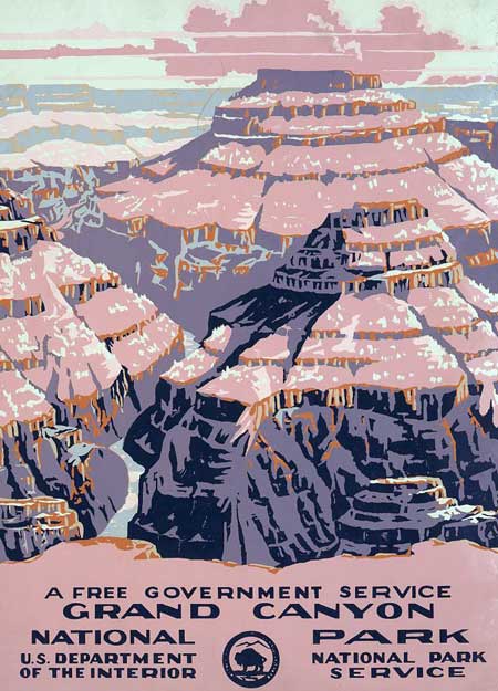
saturdayeveningpost.comcontrast reference
WPA National Parks poster tradition
Works Progress Administration National Parks silkscreen posters, 1930s
Compare the older posters’ hand-rendered scenic simplification with this panel’s typographic density, documentary imagery, and administrative color blocking.
Shared public park communication, government-sponsored design, educational purpose, strong simplified color
Different illustrative landscape focus, handmade silkscreen texture, less text-heavy, more promotional mood
Image search
WPA National Parks Grand Canyon silkscreen poster 1938