
Penguin Books logo
A clean, flat emblem built from a warm orange oval, a heavy black border, and a simplified black-and-white penguin silhouette. The visual feel is modern, friendly, and highly legible: no shading, no texture, and no background complexity. Its design depends on bold figure-ground contrast, rounded organic contours, and a compact badge-like layout that reads instantly at small scale.
Visual index
Form rounded animal silhouettethick enclosing outlinesoft organic curvesnegative-space detailingcompact colophon-like mark
Mood friendlyapproachableclassiccommercially trustworthyplayful but restrained
Color warm orange fieldsolid black silhouettewhite negative-space belly and eyehigh-contrast limited palette
Texture flat vector surfacecrisp edgesno grain or shadingprint-logo clarity
Composition centered mascotvertical oval enclosuresymmetrical badge structuregenerous internal spacingisolated mark on white ground
Related images
studiokarma.frformal echo
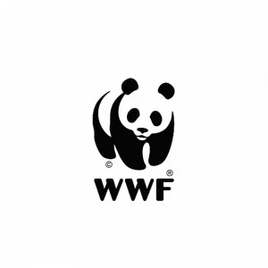
WWF Panda Logo
World Wildlife Fund panda mark, originally based on Chi-Chi the panda and developed in the early 1960s
Look at how the animal is reduced to only the most necessary black shapes, with white gaps completing the face and torso. The expressive effect comes from subtraction, not detail.
Shared black-and-white animal reduction, negative-space anatomy, friendly mascot identity, instant small-scale legibility
Different no orange enclosure, more fragmented silhouette, conservation identity rather than publishing identity
Image search
WWF panda logo black and white original mark
compositional relationship
London Underground Roundel
Edward Johnston and London Transport roundel identity system
Attend to the way the enclosure creates authority and memorability. The mark is not just an illustration; it is a sign engineered to be recognized quickly.
Shared centralized emblem, bold outline, flat color geometry, public-facing clarity
Different geometric rather than organic, typographic bar element, transport identity rather than book publishing
Image search
classic London Underground roundel logo red circle blue bar
artifactuprising.comcultural lineage
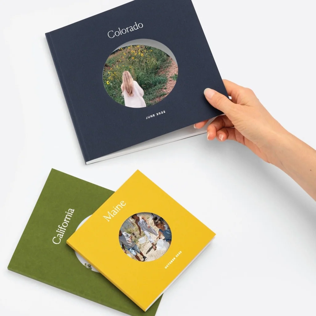
Albatross Books Paperback Covers
Albatross Books color-coded paperback series, launched in Germany in 1932
Notice the disciplined use of color and brand repetition. The appeal is not ornamental luxury but democratic accessibility through standardized, recognizable design.
Shared publishing-brand economy, modern paperback culture, limited color strategy, mass-market clarity
Different cover grid rather than standalone logo, typography-led composition, less mascot-centered
Image search
Albatross Books 1932 paperback cover design color coded

fr.dreamstime.comperiod relationship
Isotype Pictograms
Otto Neurath and Gerd Arntz’s Isotype visual language
Look for the discipline of reduction: thick silhouettes, minimal contours, and an emphasis on immediate comprehension over naturalistic description.
Shared flat silhouette logic, minimal internal detail, graphic reduction, high legibility
Different instructional rather than brand-oriented, usually monochrome, more standardized human-machine geometry
Image search
Gerd Arntz Isotype animal pictogram black silhouette
vintageclothingguides.comcultural lineage
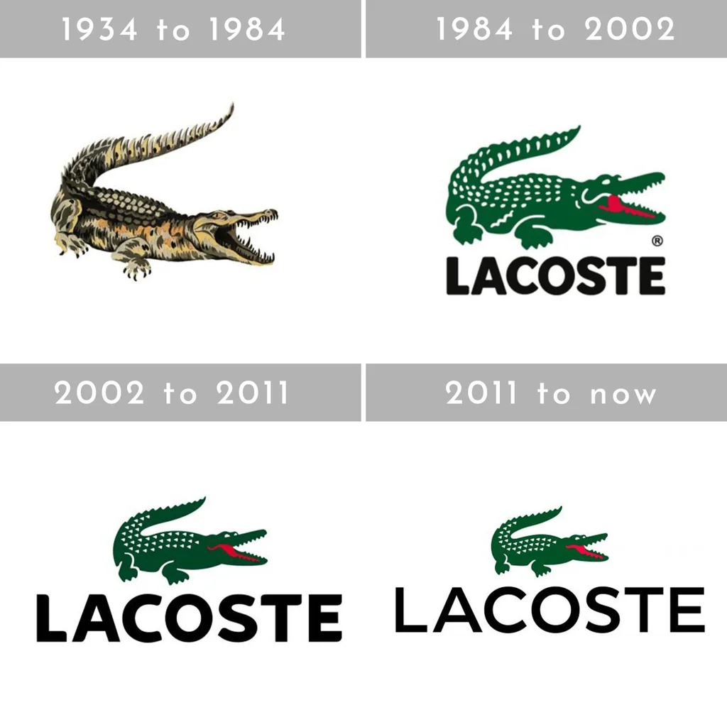
Lacoste Crocodile Emblem
Lacoste crocodile logo associated with René Lacoste and designed by Robert George in the late 1920s
Compare how a creature becomes a commercial signature. The important feature is not zoological accuracy but the balance between character and reproducibility.
Shared animal mascot branding, compact silhouette, friendly commercial identity, recognizable outline
Different horizontal body shape, embroidered fashion context, more anatomical detail, no enclosing oval
Image search
vintage Lacoste crocodile logo Robert George emblem
pinterest.comcompositional relationship
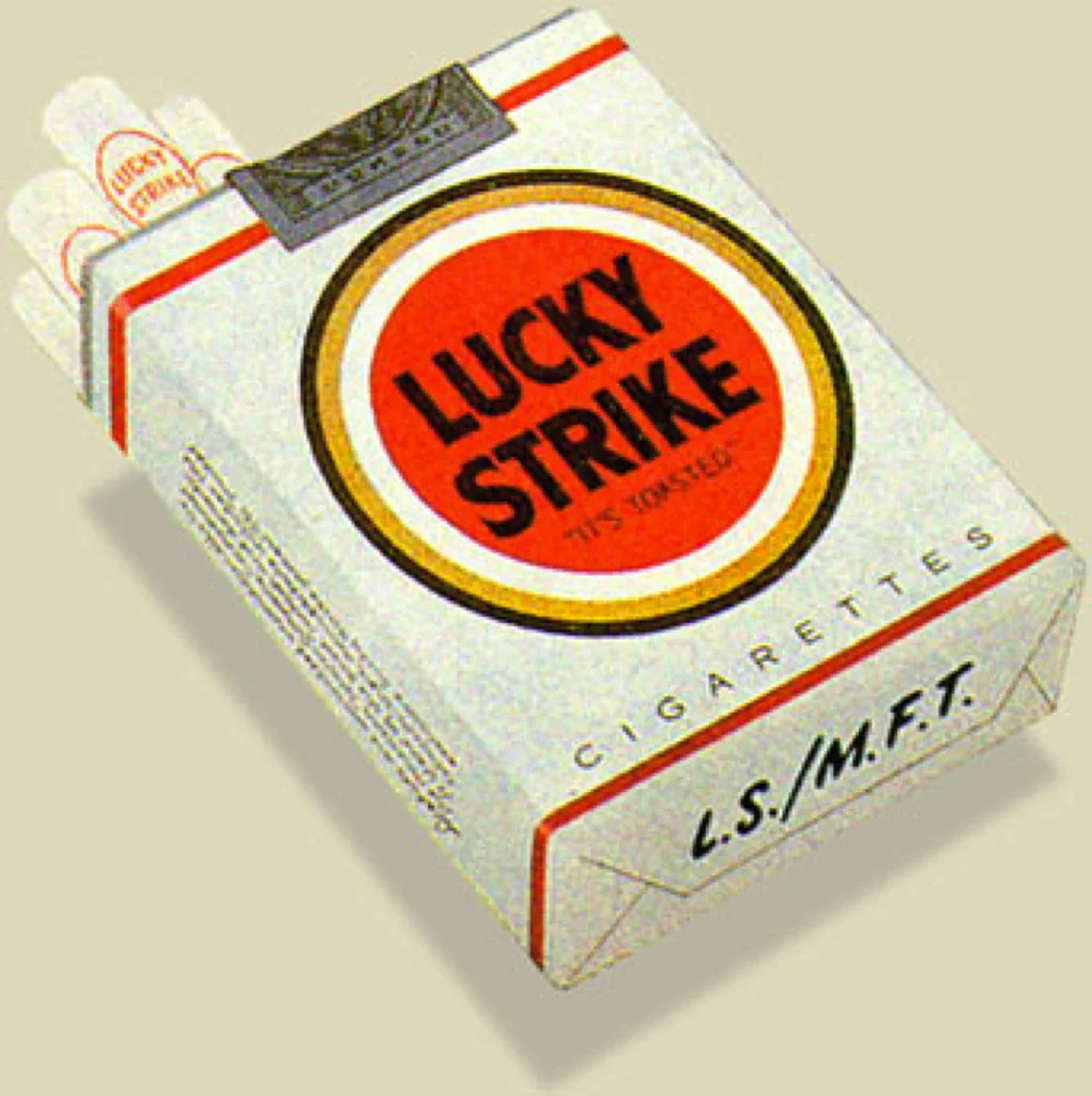
Lucky Strike Target Packaging
Raymond Loewy’s 1940 Lucky Strike package redesign with centered circular target mark
Notice the centered medallion logic: a strong outline, a flat field, and a sign that remains stable across many printed applications.
Shared central badge format, bold enclosing shape, limited palette, mass-print reproducibility
Different typographic center, red-and-white target geometry, packaging rather than publisher colophon
Image search
Raymond Loewy Lucky Strike 1940 package circular logo