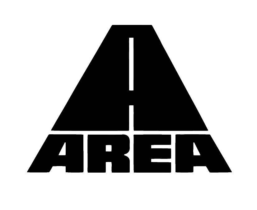
Monolithic Roadway Wordmark
A stark black-on-white logo built from heavy geometric masses: a trapezoidal road-like form rises above a compressed block wordmark, with a narrow vertical dashed line cutting through the center. The composition is symmetrical, frontal, and highly reduced, giving the mark a 1970s industrial, transit-signage, and arcade-era identity feel. Texture is absent by design; the image relies on flat silhouette, hard edges, negative-space cuts, and optical weight rather than surface detail.
Visual index
Form blocky custom letteringwide geometric capitalsstencil-like negative spacesmonumental triangular iconcompressed baseline
Mood industrialauthoritativeminimalretro-futuristutilitarian
Color solid blackwhite negative spacehigh-contrast monochromeno gradients
Texture flat vector fillcrisp hard edgesprint-logo simplicityno visible material grain
Composition centered symmetrystacked icon above wordmarkpyramid/trapezoid silhouettestrong horizontal basevertical axis emphasized by road stripe
Related images

typedeck.comformal echo
Atari Fuji logo
George Opperman’s 1972 Atari logo
Look at how a few thick black shapes create a memorable symbol through symmetry, vertical emphasis, and carefully reserved white space.
Shared central vertical axis, bold black silhouette, minimal geometric abstraction, retro technology mood
Different Atari uses curved uprights, no integrated wordmark in the emblem, more fluid internal spacing
Image search
George Opperman Atari Fuji logo 1972 black symbol
typographic relationship
NASA worm logotype
Danne & Blackburn’s 1975 NASA logotype
Notice the transformation of letters into engineered components, with simplified counters, thick strokes, and a futuristic institutional tone.
Shared custom geometric lettering, heavy stroke economy, modernist corporate identity feel, reduced letter interiors
Different NASA worm is rounded, NASA mark is usually red, more continuous linear construction
Image search
NASA worm logo 1975 Danne Blackburn red logotype

commons.wikimedia.orgtypographic relationship
Eurostile Extended sci fi typography
Aldo Novarese’s Eurostile Extended typeface, 1962
Focus on the squared counters, extended proportions, and mechanical spacing that make the letters feel architectural rather than handwritten.
Shared extended capital proportions, rectangular counters, machine-age geometry, low-detail letterforms
Different Eurostile is less heavy, more standardized typeface rhythm, rounded-square corners rather than sharp stencil cuts
Image search
Eurostile Extended typeface specimen uppercase
epg.modot.orgmedium reference
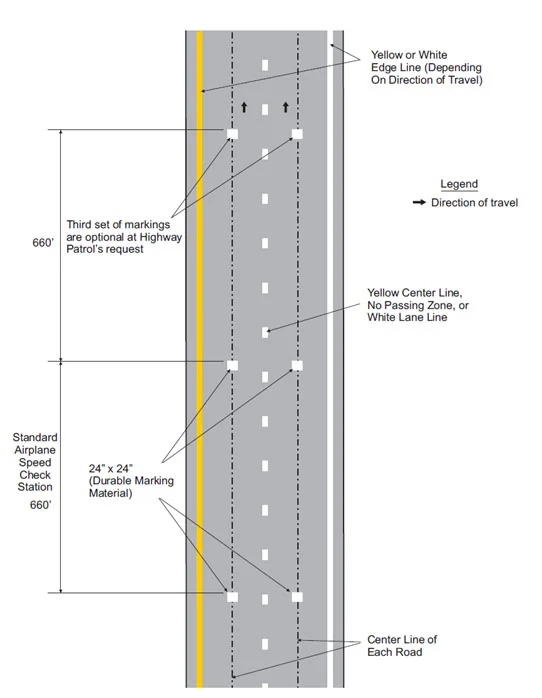
MUTCD road marking graphics
U.S. Manual on Uniform Traffic Control Devices pavement lane markings
Observe how road space is reduced to a few legible graphic codes: lane stripe, black ground, and directional taper.
Shared dashed center stripe, diagrammatic road perspective, functional black-white contrast, directional visual pull
Different MUTCD graphics are informational, usually not paired with display lettering, less emblematic symmetry
Image search
MUTCD dashed white lane line pavement marking diagram
munich72collected.comcultural lineage
Otl Aicher pictogram modernism
Otl Aicher’s Munich 1972 Olympic pictogram system
Look for the disciplined simplification of form: a complex idea is translated into a flat, instantly readable graphic sign.
Shared high legibility, flat black forms, systematic reduction, public-signage clarity
Different Aicher uses human figures, more modular grid consistency, less typographic mass
Image search
Otl Aicher Munich 1972 Olympic pictograms black white grid
imjustcreative.comperiod relationship
WipEout game branding
The Designers Republic’s branding for WipEout, 1995
Attend to the compact logo architecture, hard-edged futurism, and the way typography suggests velocity and engineered space.
Shared techno-industrial mood, bold custom logotype, speed-oriented geometry, high-contrast branding
Different WipEout uses more color systems, more fragmented information design, denser secondary typography
Image search
The Designers Republic WipEout 1995 logo branding Psygnosis