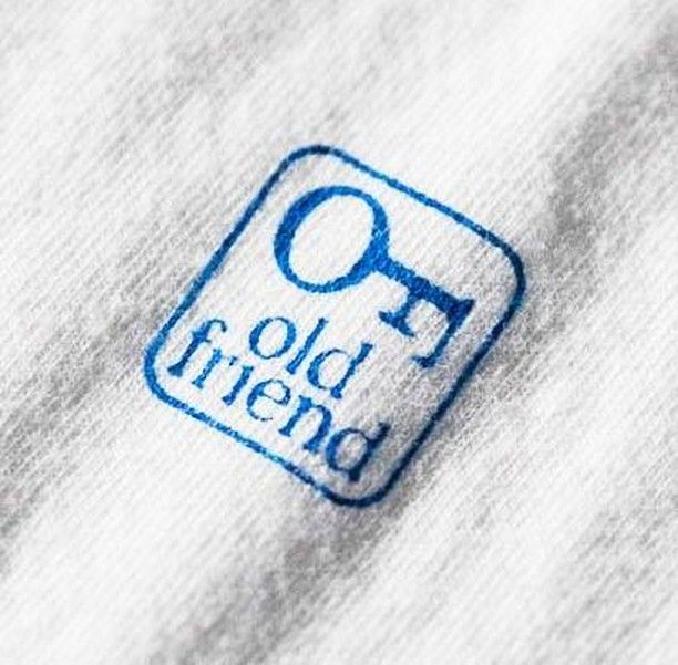
Old Friend key logo fabric mark
A small cobalt-blue fabric mark sits diagonally on soft white knit, combining a rounded-square border, a simple key icon, and lowercase serif lettering. The feel is modest, tactile, and nostalgic: more like a garment stamp, bookplate, or heritage label than a polished digital logo. The uneven textile surface, slight ink softness, and close-up crop make the design feel intimate and worn-in, with the key symbol giving the mark an old-fashioned, keepsake quality.
Visual index
Form simple key silhouettelowercase serif typographyrounded-corner badgecompact emblem layoutstamp-like linework
Mood nostalgichumbledomestictrustworthykeepsake-likequietly vintage
Color cobalt blue inkoff-white fabric groundsoft gray textile shadowslow-contrast neutral background
Texture ribbed knit fabricslightly fuzzy fibersink absorbed into clothsoft blur and shallow focusworn stamped-label finish
Composition diagonal close-up cropsmall centered badgeicon above stacked wordmarkrounded-square frameample fabric surrounding the mark
Related images
levistrauss.commaterial kinship
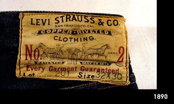
Heritage garment labeling
Levi’s Two Horse Pull leather patch
Look at how the brand mark becomes part of the object’s surface: the label is not just information, but a sign of age, handling, and reliability.
Shared small authenticity mark, heritage-brand tone, material wear, product-surface branding
Different tan leather patch, detailed pictorial scene, rectangular patch format, more rugged Western coding
Image search
Levi's Two Horse Pull leather patch close up jeans label
etsy.comcultural lineage
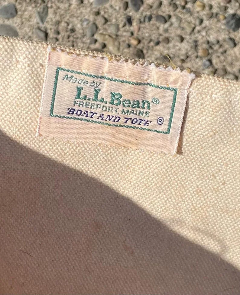
New England utility branding
L.L.Bean Boat and Tote cloth label
Notice the plain cloth context, restrained brand scale, and the way a simple label can make an everyday textile object feel dependable and long-lived.
Shared cloth-based branding, domestic utility mood, small label scale, heritage reassurance, light fabric ground
Different script-heavy wordmark, sewn woven label, green or multicolor accents, more outdoors-and-canvas association
Image search
L.L.Bean Boat and Tote woven label close up
logodesignlove.comformal echo
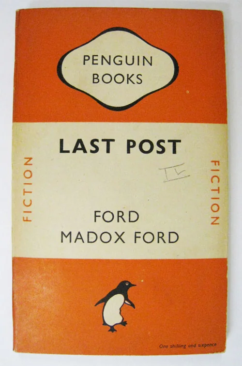
Icon above type publishing mark
Penguin Books colophon by Edward Young
Focus on the vertical hierarchy: emblem first, name beneath, all compressed into a mark that can survive at small scale.
Shared icon-over-name structure, approachable emblem, compact vertical hierarchy, vintage friendliness
Different animal mascot, printed book-cover context, bolder graphic contrast, mass-market color system
Image search
Penguin Books original 1935 colophon Edward Young
carleton.educultural lineage
Bookplate and printer s mark tradition
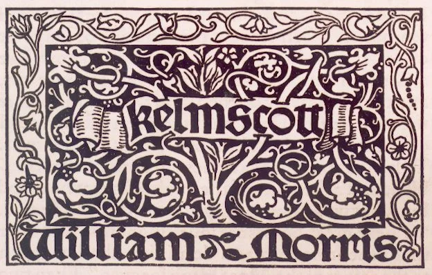
Kelmscott Press printer’s mark associated with William Morris
Look for the way a border, symbol, and lettering create a tiny self-contained world, closer to a seal or bookplate than a conventional retail tag.
Shared enclosed emblem, old-world typographic feeling, provenance-mark function, craft association
Different much more ornate decoration, black ink tradition, medieval revival density, print rather than fabric
Image search
Kelmscott Press printer's mark William Morris black emblem
pinterest.comperiod relationship
Vintage woven textile label
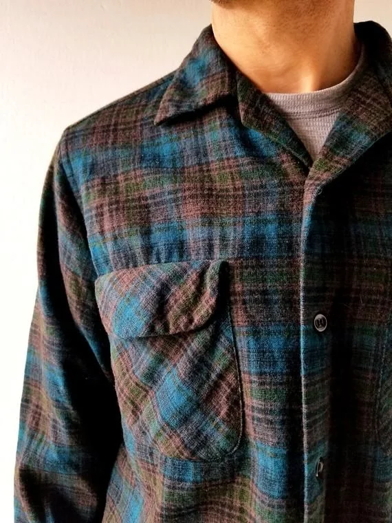
Pendleton Woolen Mills vintage shirt label
Pay attention to how aged typography and woven or stamped texture make a label feel archival, even when the design is simple.
Shared blue textile mark, serif lettering, garment-label intimacy, nostalgic brand voice, soft material context
Different more rectangular label layout, additional brand information, stronger Western woolen-mill identity, often woven rather than stamped
Image search
Pendleton Woolen Mills vintage blue shirt label close up

avery.comcontrast reference
Apothecary minimalism
Aesop product label typography
Compare the disciplined typographic hierarchy with the uploaded image’s softer, more irregular textile impression; one feels clinical, the other keepsake-like.
Shared restrained typography, limited palette, label-centered design, quiet trust tone
Different paper packaging context, clean modern grid, no emblematic icon, less tactile irregularity
Image search
Aesop product label close up serif typography