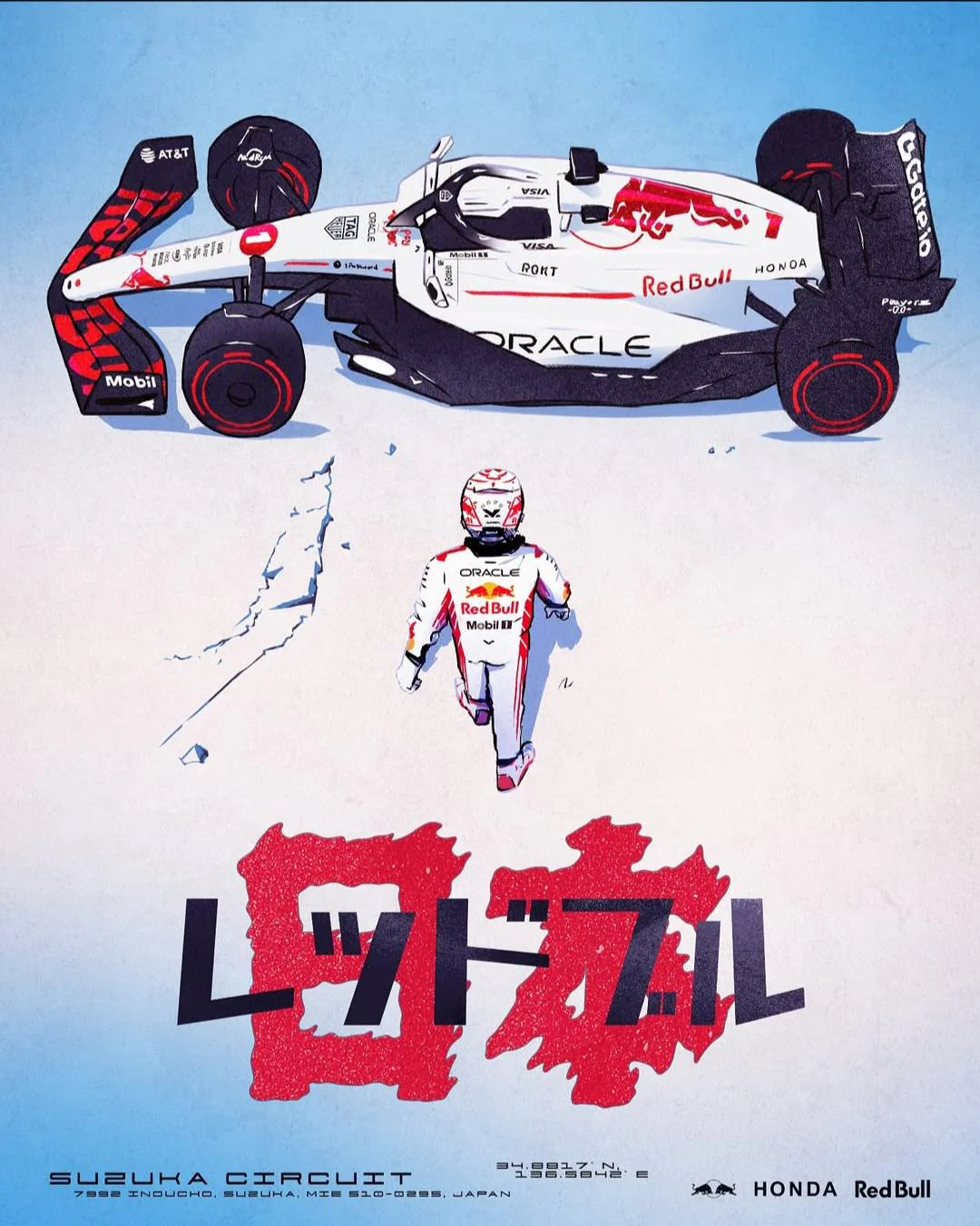
Japanese Grand Prix
The image has the feel of a contemporary motorsport poster filtered through Japanese manga and anime design conventions. A clean white-and-blue field is interrupted by a sharply outlined racing car, a small central driver figure, and a heavy katakana title block over a rough red brush-texture shape. The palette is disciplined—white, black, red, and pale sky blue—while the drawing uses cel-like shadows, inked contours, sponsor decals, and light paper grain to create a printed-poster tactility. The layout is vertical and hierarchical: machine across the top, figure in the middle, title and event information anchoring the bottom.
Visual index
Form flattened side-profile engineering formangular aerodynamic shapesblocky katakana letteringinked outlinesgraphic shadow masses
Mood heroictechnicalcoolpromotionalanime-inflected
Color white groundblack contouringRed Bull red accentspale blue gradientsmall sponsor-logo color hits
Texture paper grainscreen-print specklerough red brush fieldcel-shaded shadow blockscrisp decal-like markings
Composition large horizontal vehicle silhouette at topsmall centered figure as scale markerbold title block near bottomwide negative spaceposter-like vertical hierarchy
Related images

reddit.comcompositional relationship
Katsuhiro Otomo Akira theatrical poster language
Akira, 1988 Japanese theatrical poster showing Kaneda walking toward the red motorcycle
Look at the way scale is dramatized: a lone figure is placed in a large field of negative space, while the vehicle becomes an emblematic object with heavy outlines and red graphic energy.
Shared small human figure against machine, Japanese title emphasis, red-black-white graphic tension, cinematic negative space, hero-object staging
Different Akira uses a darker urban mood, motorcycle instead of race car, more dramatic perspective, less sponsor-logo density
Image search
Akira 1988 Japanese theatrical poster Kaneda walking to red motorcycle
picclick.comformal echo
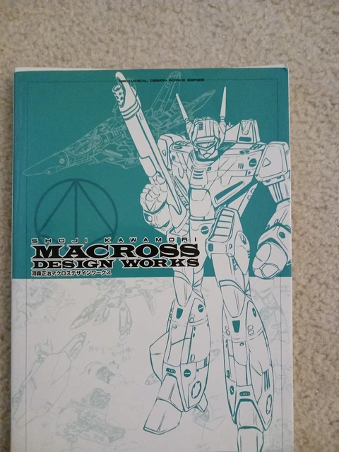
1980s Japanese mecha model sheet and box art illustration
Studio Nue and Shoji Kawamori Macross mechanical design illustrations
Attend to the technical surface language—panel divisions, tiny decals, compact logos, and the way black shadow shapes clarify the machine’s structure.
Shared technical decal clusters, white mechanical surfaces, black underside masses, precise ink contours, anime-style engineering clarity
Different Macross centers fictional mecha aircraft, more mechanical panel complexity, often uses exploded or orthographic views, less event-poster typography
Image search
Shoji Kawamori Macross Valkyrie mechanical design illustration decals

thegentlemanracer.comcultural lineage
Honda F1 national racing graphic lineage
Honda RA272 Formula 1 car, 1965 Mexican Grand Prix livery
Notice how white becomes a ceremonial racing color rather than an empty background, with red marks carrying both speed and Japanese visual identity.
Shared white racing body, red graphic accents, Honda motorsport association, minimal national palette, clean technical profile
Different RA272 is more sparse and vintage, fewer sponsor marks, rounder 1960s bodywork, photographic rather than illustrated in many references
Image search
1965 Honda RA272 Formula 1 white red sun livery side view

motorsport.comcolor relationship
Oracle Red Bull Racing Honda tribute livery
Red Bull Racing RB16B white Honda tribute livery, 2021 Turkish Grand Prix
Focus on how the red bull mark, black aerodynamic zones, and white bodywork are balanced so the car reads as both corporate livery and Japanese homage.
Shared white Red Bull-Honda palette, red bull emblem, black aerodynamic forms, sponsor decal hierarchy, Japanese tribute feeling
Different reference is a real racing livery, less poster grain, no large katakana title block, usually seen in photography
Image search
Oracle Red Bull Racing RB16B white Honda tribute livery Turkish Grand Prix 2021 side view
creativebloq.comperiod relationship
Yusaku Kamekura and Tokyo 1964 modernist sports graphics
Yusaku Kamekura, Tokyo 1964 Olympic Games poster system
Look at the balance between emptiness and authority: large blank areas make the few graphic elements feel official, iconic, and event-like.
Shared red-white-black discipline, formal event-poster structure, large negative space, clean information hierarchy, Japanese modernist restraint
Different Tokyo 1964 is more geometric, photographic or emblem-based imagery, less manga linework, no motorsport sponsor clutter
Image search
Yusaku Kamekura Tokyo 1964 Olympics official poster red sun typography

fineartamerica.commedium reference
Gran Turismo promotional and interface minimalism
Gran Turismo PlayStation cover and menu graphics by Polyphony Digital
Notice the polished restraint: automotive form is isolated, typography is precise, and the design treats speed as something measured, engineered, and branded.
Shared isolated racing vehicle, technical typographic feel, cool blue-white atmosphere, motorsport branding, simulation-like clarity
Different Gran Turismo is usually photographic or 3D-rendered, less hand-drawn texture, more corporate minimalism, less Japanese brush typography
Image search
Gran Turismo 4 PlayStation 2 cover art white car minimalist typography

reddit.comcultural lineage
Initial D manga motorsport graphic culture
Shuichi Shigeno, Initial D manga covers and title pages
Look for how the car is not only depicted but mythologized through bold Japanese type, hard contours, and a sense of competitive ritual.
Shared Japanese racing culture, inked automotive contours, bold kana typography, speed-centered drama, posterized car identity
Different Initial D focuses on street racing, more dynamic motion lines, grittier manga rendering, less corporate sponsor design
Image search
Shuichi Shigeno Initial D manga cover car Japanese typography