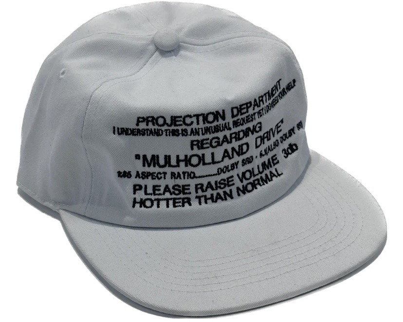
Grey cap with projection memo
A pale grey cotton cap turns a technical projection note into a front-facing graphic field. The design feels utilitarian and archival: black embroidered all-caps text is compressed across the crown like a work-order label, while the soft twill, stitched brim, and slightly curved cap form pull the language into streetwear and promotional merch territory. The mood is deadpan, insiderish, and procedural, with visual tension between casual apparel and precise cinema-booth instructions.
Visual index
Form structured six-panel capflat-to-curved brimcompressed all-caps letteringbadge-like informational layout
Mood deadpantechnicalcinephile-insiderutilitarianarchival
Color pale grey cottonblack embroiderylow-contrast monochromeneutral white background
Texture woven cotton twillraised embroideryvisible seam panelsstitched brim rings
Composition front-centered text blockslightly angled product viewdense horizontal lines across crownwide blank brim balancing busy typography
Related images
Redditcultural lineage
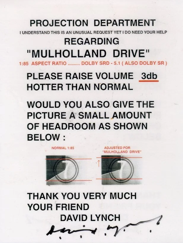
Projection booth instruction ephemera
David Lynch’s projectionist note for Mulholland Drive screenings
Look at how the language is specific, procedural, and addressed to a worker behind the scenes; the authority comes from aspect ratios, sound formats, and volume instructions rather than imagery.
Shared projection-department wording, film-exhibition specifications, all-caps urgency, deadpan technical tone, Mulholland Drive reference
Different paper memo origin, not originally apparel, more document-like spacing
Image search
David Lynch Mulholland Drive projectionist note
spruethmagers.comformal echo
Conceptual text art
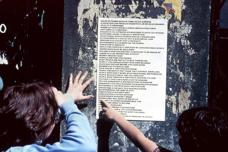
Jenny Holzer, Truisms
Notice the impersonal voice, the compact statements, and the way text becomes an object before it becomes a message.
Shared text as image, authoritative phrasing, black-on-light contrast, public-instruction tone
Different aphoristic content, gallery and public-art context, cleaner typographic hierarchy
Image search
Jenny Holzer Truisms black text poster
MoMAtypographic relationship
Bold appropriated typography
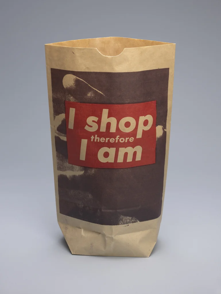
Barbara Kruger, Untitled (I shop therefore I am)
Attend to the visual force of short, bold, capitalized wording and how the viewer is positioned as someone being instructed or addressed.
Shared bold sans-serif emphasis, direct address, black text dominance, language as graphic surface
Different red-and-white palette, photomontage context, more confrontational slogan structure
Image search
Barbara Kruger I Shop Therefore I Am
Judd Tullyformal echo
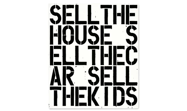
Word painting compression
Christopher Wool, Apocalypse Now text painting
Look for the way words are packed into a rectangular field, with imperfect legibility becoming part of the visual energy.
Shared stacked uppercase text, black lettering, compressed reading rhythm, abrasive graphic density
Different painted canvas scale, deliberate word breaks, art-market object rather than wearable object
Image search
Christopher Wool Apocalypse Now word painting
garmentory.comcultural lineage
Anti logo streetwear
Vetements DHL logo T-shirt
Notice how bureaucratic or workplace graphics become desirable because they look unstyled, official, and oddly specific.
Shared workplace graphic language, ironic institutional tone, minimal color palette, fashion use of non-fashion codes
Different bright corporate colors, large logo mark, more overt brand appropriation
Image search
Vetements DHL logo t shirt
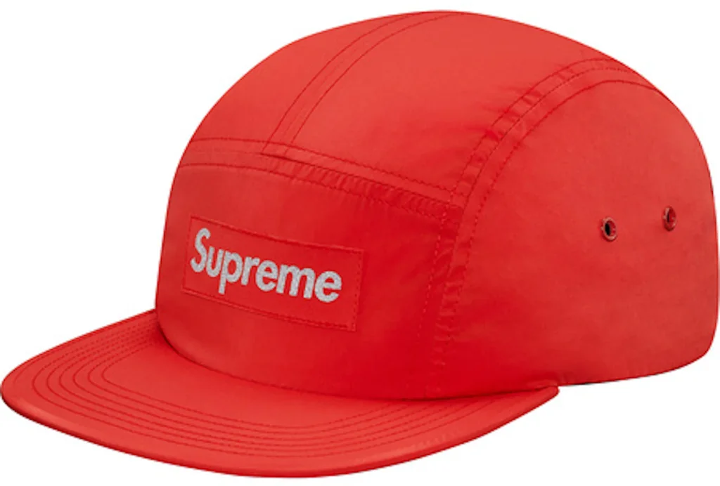
StockXmaterial kinship
Camp cap streetwear placement
Supreme box logo camp cap
Focus on the embroidered front panel, the casual cap silhouette, and the way a small graphic block carries identity at close range.
Shared front-panel embroidery, casual headwear format, wearable identity marker, compact graphic field
Different logo-first branding, red rectangular badge, less text-heavy layout
Image search
Supreme red box logo camp cap
MoMAperiod relationship
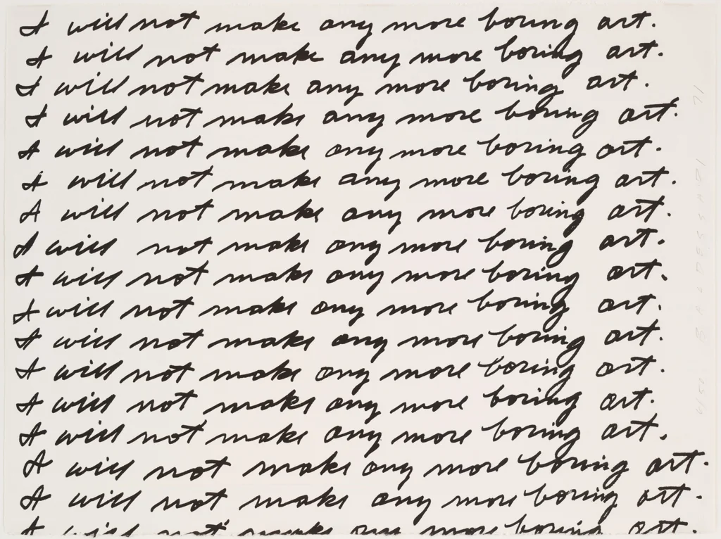
Conceptual classroom repetition
John Baldessari, I Will Not Make Any More Boring Art
Notice how repetition, obedience, and institutional address can become visual form without illustration or ornament.
Shared instructional language, plain black text, conceptual deadpan, administrative mood
Different handwritten repetition, paper-based art object, more performative self-reference
Image search
Baldessari Boring Art lithograph