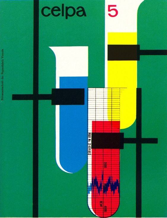
Celpa 5 cover
A hard-edged modernist layout built from saturated green, primary-color vertical capsules, black rule structures, and sparse sans-serif typography. The composition feels like a fusion of laboratory diagram, industrial chart, and Swiss-influenced editorial cover: flat planes, gridded measurement marks, and asymmetrical balance create a technical but playful mood. Texture is mostly smooth printed ink with slight vintage reproduction softness, emphasizing crisp geometric form over illustration.
Visual index
Form rounded capsule shapesrectangular black barsthin measurement gridlowercase sans-serif letteringvertical scientific-chart elements
Mood technicaloptimisticindustrialmid-century moderncontrolled playfulness
Color saturated emerald green fieldprimary blue, red, and yellow accentsheavy black structural barscream-white negative spacesmall red typographic numeral
Texture flat lithographic inkslight print grainclean hard edgesvintage paper softness
Composition asymmetrical vertical layoutoverlapping geometric modulesstrong black crossbar gridlarge color-field backgrounddiagram-like central column
Related images
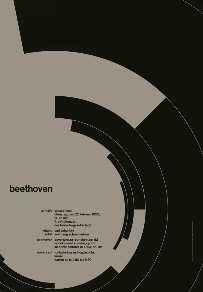
neugraphic.comcompositional relationship
Swiss International Typographic Style
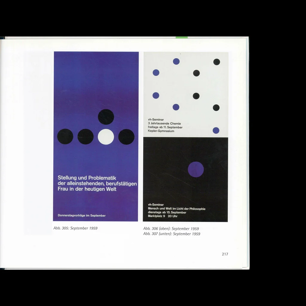
Josef Müller-Brockmann concert posters for the Tonhalle, Zürich, 1950s
Look at how black lines, type, and colored elements lock into an invisible grid while leaving broad flat areas of color or paper to carry the design.
Shared asymmetrical grid, sans-serif typography, flat color fields, precise alignment, modernist restraint
Different more pictorial laboratory imagery, brighter industrial palette, less typographic hierarchy
Image search
Josef Muller Brockmann Tonhalle Zurich 1955 poster Beethoven
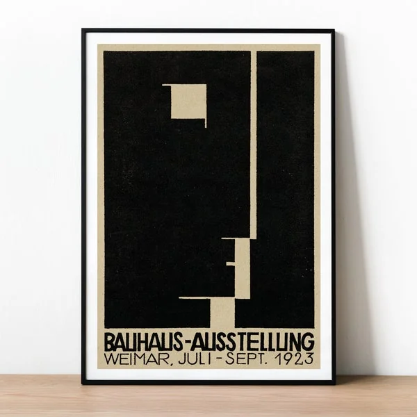
etsy.comperiod relationship
Bauhaus functional graphics
Herbert Bayer, Bauhaus exhibition poster, 1923
Attend to the way typography becomes part of the architecture of the page rather than a caption placed on top of an image.
Shared lowercase modern type, geometric construction, functional clarity, industrial optimism
Different Bauhaus example is more typographically dominant, less saturated green field, more early-avant-garde spacing
Image search
Herbert Bayer 1923 Bauhaus exhibition poster Weimar
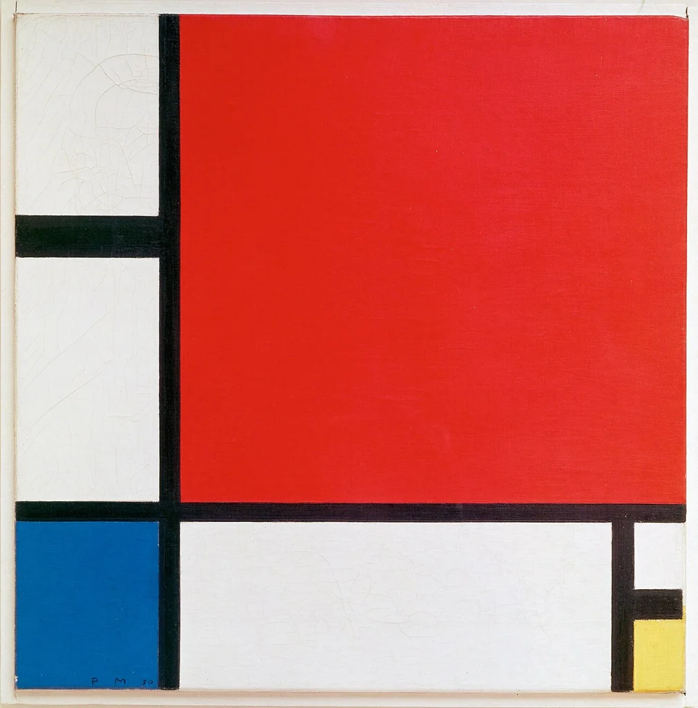
Wikimedia Commonsformal echo
De Stijl and Neo Plastic composition
Piet Mondrian, Composition with Red Blue and Yellow, 1930
Compare the role of black lines as structural beams separating zones of intense primary color and white space.
Shared black linear scaffolding, primary color blocks, rectangular geometry, flatness
Different green dominant background, rounded scientific forms, applied commercial layout
Image search
Piet Mondrian Composition with Red Blue and Yellow 1930 painting
reddit.comcultural lineage
Constructivist graphic design
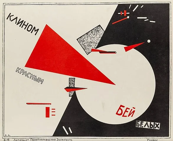
El Lissitzky, Beat the Whites with the Red Wedge, 1919
Notice how geometric shapes are not decorative but directional: they cut, overlap, and organize the viewer’s reading path.
Shared abstract geometric language, bold black accents, dynamic asymmetry, graphic urgency
Different less diagonal movement, more corporate-industrial tone, softer mid-century palette
Image search
El Lissitzky Beat the Whites with the Red Wedge 1919
projekt26.comcultural lineage
Polish postwar modernist graphic design
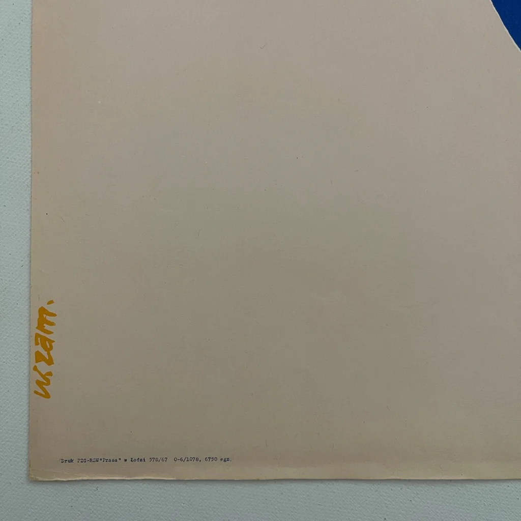
Wojciech Zamecznik exhibition and industrial posters, 1950s–1960s
Look for the tension between rational diagramming and expressive visual wit: the design is ordered, but the colored tube-like forms make it memorable and slightly playful.
Shared Polish modernist sensibility, industrial subject coding, experimental layout, bold flat color, diagrammatic imagery
Different more cover-like than poster-like, less photographic experimentation, more rigid black grid
Image search
Wojciech Zamecznik Polish poster industrial design 1960s
designreviewed.comformal echo
Ulm School systems design
Otl Aicher and Hochschule für Gestaltung Ulm visual communication work, 1950s–1960s
Focus on the controlled spacing, modular pieces, and the way informational marks—numbers, grid lines, and measurement ticks—become visual texture.
Shared systems-based layout, technical signage feel, modular geometry, reduced sans-serif type
Different more vivid color saturation, more illustrative central motif, less corporate neutrality
Image search
Hochschule fur Gestaltung Ulm visual communication Otl Aicher grid poster