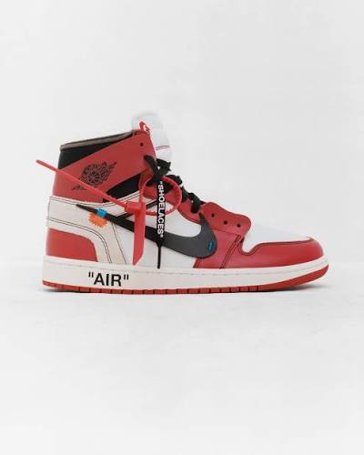
Off-White x Air Jordan 1 Retro High OG “Chicago”
A clean side-profile product image presents a high-top sneaker as a graphic construction of red, white, black, and small industrial accents. The visual feel is crisp and engineered: classic athletic color-blocking is interrupted by exposed foam edges, shifted panels, oversized quoted text, a dangling zip tie, and an appliqué-like blue-orange tag. The composition is minimal and catalog-like, using negative space to emphasize the shoe’s flattened silhouette, while the design language mixes basketball heritage with conceptual fashion deconstruction.
Visual index
Form high-top basketball silhouetteoversized displaced Swooshfragmented panel constructiontagged and annotated surfacesflat graphic side elevation
Mood collectibleindustrialself-awarestreetwear-focusedcurated and archival
Color Chicago red, white, and black palettesmall orange and blue accent markshigh-contrast panel blockingneutral white studio background
Texture smooth leather panelsexposed foam collar and tongue edgesrubber outsoleplastic zip-tie hardwareprinted quotation text
Composition strict lateral profilecentered object on empty fieldhorizontal sole line anchoring the imagelayered overlays across the midfoot
Related images
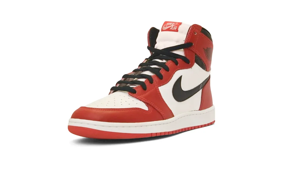
RM Sotheby'scultural lineage
1980s Nike basketball color blocking
Peter Moore, Nike Air Jordan 1 “Chicago,” 1985
Look at how the red overlays frame the toe, eyelets, heel, and ankle while the white quarter panel creates a bright central field for the black Swoosh. The historical design is clean and resolved, whereas the uploaded version foregrounds interruption and reconstruction.
Shared red-white-black blocking, high-top basketball collar, side Swoosh placement, perforated toe box, rubber cupsole
Different cleaner panel finish, no quoted text, no zip tie, standard Swoosh scale, less exposed construction
Image search
Nike Air Jordan 1 Chicago 1985
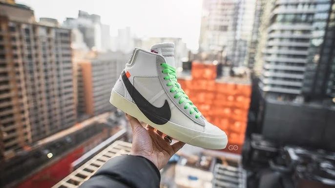
YouTubeformal echo
Virgil Abloh s deconstructed Nike language
Off-White x Nike Blazer Mid from “The Ten,” 2017
Notice the enlarged or displaced Swoosh, the exposed foam, the orange tab, and the sense that the shoe has been taken apart and reassembled without hiding the process.
Shared exposed foam edges, orange tab detail, oversized Swoosh intervention, industrial labeling, deconstructed sportswear silhouette
Different Blazer rather than Jordan shape, taller vintage court profile, different color emphasis, less Chicago-specific heritage
Image search
Off-White Nike Blazer Mid Ten
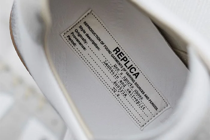
Sneaker Freakercultural lineage
Maison Margiela deconstruction
Maison Margiela Replica sneaker and Tabi design language
Attend to the way Margiela often makes construction, labeling, and absence of polish feel intentional rather than unfinished. The uploaded shoe similarly turns normally hidden production cues into the main visual message.
Shared visible construction logic, anti-polish finish, conceptual labeling, fashion reinterpretation of utilitarian footwear
Different more muted palette, less logo-forward branding, European avant-garde context, softer athletic nostalgia
Image search
Maison Margiela Replica white sneaker label
color relationship
Russian Constructivist graphic contrast
Alexander Rodchenko, “Books (Please)!” poster, 1924
Look for hard-edged contrast, forceful red shapes, and black graphic elements that cut through white space. The uploaded image uses footwear panels and branding in a similarly declarative way.
Shared red-black-white contrast, bold graphic segmentation, diagonal visual energy, poster-like readability
Different political print medium, typographic centrality, flat illustration rather than leather object, collective propaganda context
Image search
Rodchenko Books Please red black poster
typographic relationship
Conceptual text as object design
Jenny Holzer’s “Truisms” text works
Notice how plain, high-contrast text becomes a visual material. In both cases, language is not just information; it changes how the viewer reads the object in front of them.
Shared plain sans-serif text, language as visual device, self-conscious quotation, object-surface annotation
Different public text installation context, no sportswear heritage, more language-driven than form-driven, less color-blocked
Image search
Jenny Holzer Truisms black white text
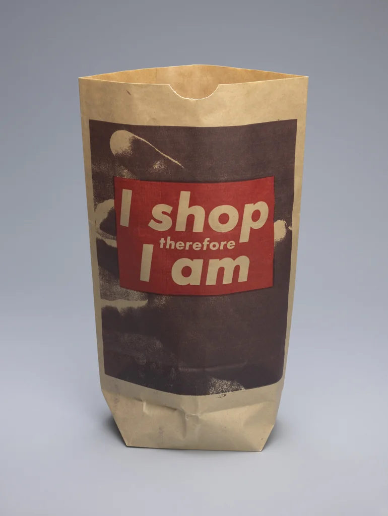
MoMAcontrast reference
Barbara Kruger s quoted consumer address
Barbara Kruger, “I shop therefore I am,” 1987
Compare the crisp black-white-red typography and the confrontational use of consumer language. Kruger’s work critiques desire directly; the uploaded object makes desire collectible and wearable.
Shared red-white-black palette, bold textual intervention, consumer culture awareness, graphic immediacy
Different photomontage art format, explicit critique, text dominates image, not a wearable product
Image search
Barbara Kruger I shop therefore am