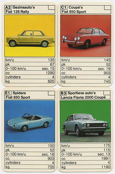
Four Vintage Car Stat Cards
The image has the feel of a mid-20th-century collectible card layout: small rounded rectangles arranged in a strict grid, each combining a car illustration or photo with tabular performance data. The visual language is functional and play-oriented, with cream card stock, black rule lines, compact sans-serif typography, and saturated flat color fields behind the vehicles. Its mood is orderly, nostalgic, technical, and slightly toy-like, mixing catalog rationality with the bright immediacy of children’s card games.
Visual index
Form rectangular cards with rounded cornersside-profile and three-quarter car viewscompact data tablesbold category labelssmall-scale collectible format
Mood nostalgicsystematicplayfultechnicalcatalog-like
Color cream card stockblack lineworkprimary-like yellow, red, blue, and green panelsmuted automotive grays and pastelsslightly aged print tones
Texture matte printed paperslight ink softnessvintage offset reproductionthin ruled table linesworn collectible-card surface
Composition four-card gridrepeated modular layoutimage-over-data hierarchyboxed headers and statistic rowsrounded-corner card format
Related images
picclick.co.ukcultural lineage
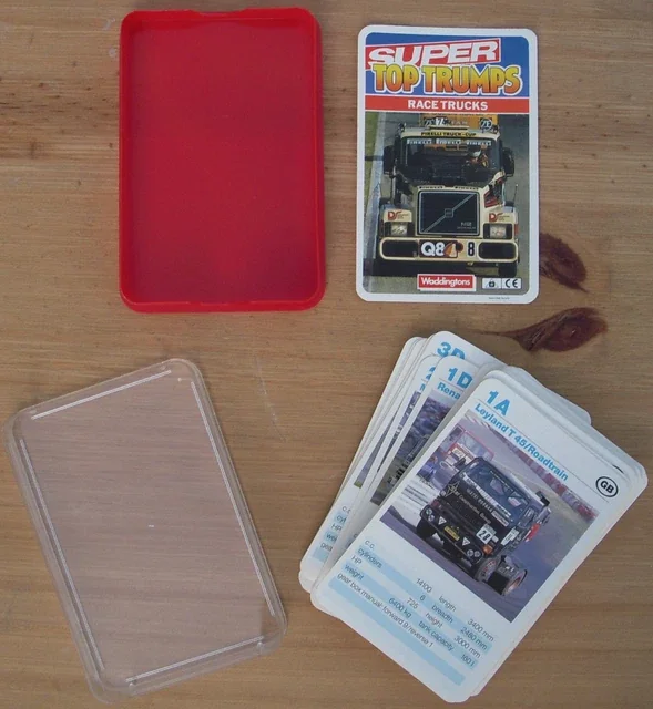
Top Trumps automotive stat cards
Waddingtons Top Trumps Cars and Super Cars decks, 1970s
Look at how each card turns the subject into comparable data, using a picture at the top and a stack of simple numeric categories below.
Shared vehicle image plus statistics, small collectible card scale, competitive comparison logic, bold header bands, tabular numeric rows
Different Top Trumps often uses English category labels, some decks have denser color branding, often more dramatic fantasy-style card titles
Image search
1970s Waddingtons Top Trumps Super Cars card deck examples
delcampe.netcultural lineage
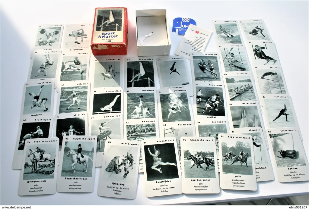
Dutch kwartet card game design
Jumbo and Hausemann & Hötte kwartet card games, 1960s–1970s
Attend to the coded labels in the corner, the category names, and the repeated family-like grouping across cards rather than a single poster-like composition.
Shared letter-number indexing, Dutch category labels, grouped subject taxonomy, plain instructional typography, rounded playing-card format
Different many kwartet decks use illustration-heavy covers, some have less statistical comparison, often designed for set collection rather than direct ranking
Image search
Jumbo auto kwartet 1970s Dutch car cards
fontsinuse.comformal echo
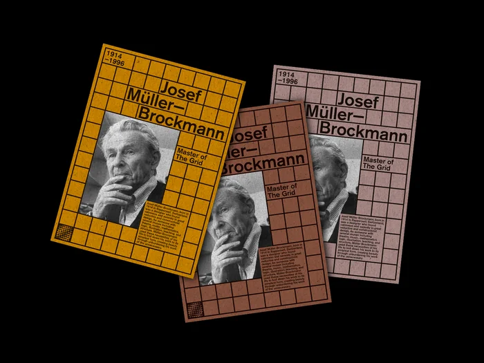
International Typographic Style information grids
Josef Müller-Brockmann exhibition posters and Swiss grid-based graphic design
Notice the disciplined horizontal rules, consistent margins, left-aligned labels, and the way information is made legible through repetition rather than decoration.
Shared strict grid structure, sans-serif typography, ruled information fields, hierarchical alignment, economical visual system
Different Swiss design is usually more spacious, less playful color blocking, more abstract and refined typography
Image search
Josef Müller-Brockmann grid typography poster examples
fastestlaps.commedium reference
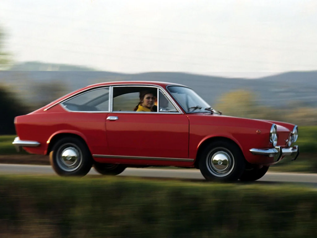
1970s European car brochure imagery
Fiat 128 and Fiat 850 Sport sales brochures, early 1970s
Look at the side-profile vehicle presentation and the conversion of engineering facts—speed, horsepower, displacement, weight—into selling points.
Shared automotive specification data, clean car profile views, bright display backgrounds, technical-performance emphasis, compact catalog logic
Different brochures are larger and more photographic, more lifestyle copy and branding, less game-like repetition
Image search
Fiat 850 Sport Coupe 1970 brochure technical specifications

bbc.co.ukmaterial kinship
Panini collectible sticker albums
Panini Calciatori and automotive sticker albums, 1960s–1970s
Focus on the tactile scale, the bordered picture cells, and the way each item feels like one unit in a larger archive or set.
Shared collectible paper ephemera, indexed visual units, repeated card-like framing, compact captions, mass-printed color
Different stickers usually lack detailed stat tables, album pages provide the larger grid, sports imagery often uses portraits or action shots
Image search
1970s Panini sticker album page layout examples
ebay.comformal echo
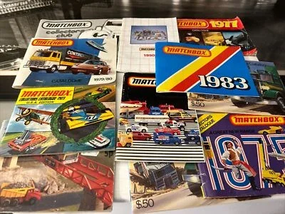
Matchbox and Corgi toy car catalog graphics
Lesney Matchbox collector catalog pages, 1960s–1970s
Look for the similarity between the cropped car silhouettes, the bright display colors, and the sense that each vehicle is a specimen in a catalog system.
Shared isolated car specimens, bright color panels, collectible-object framing, small product-image scale, catalog-like repetition
Different toy catalogs emphasize miniature models, usually fewer performance statistics, often more brand-forward packaging graphics
Image search
Lesney Matchbox 1970 collector catalogue car images