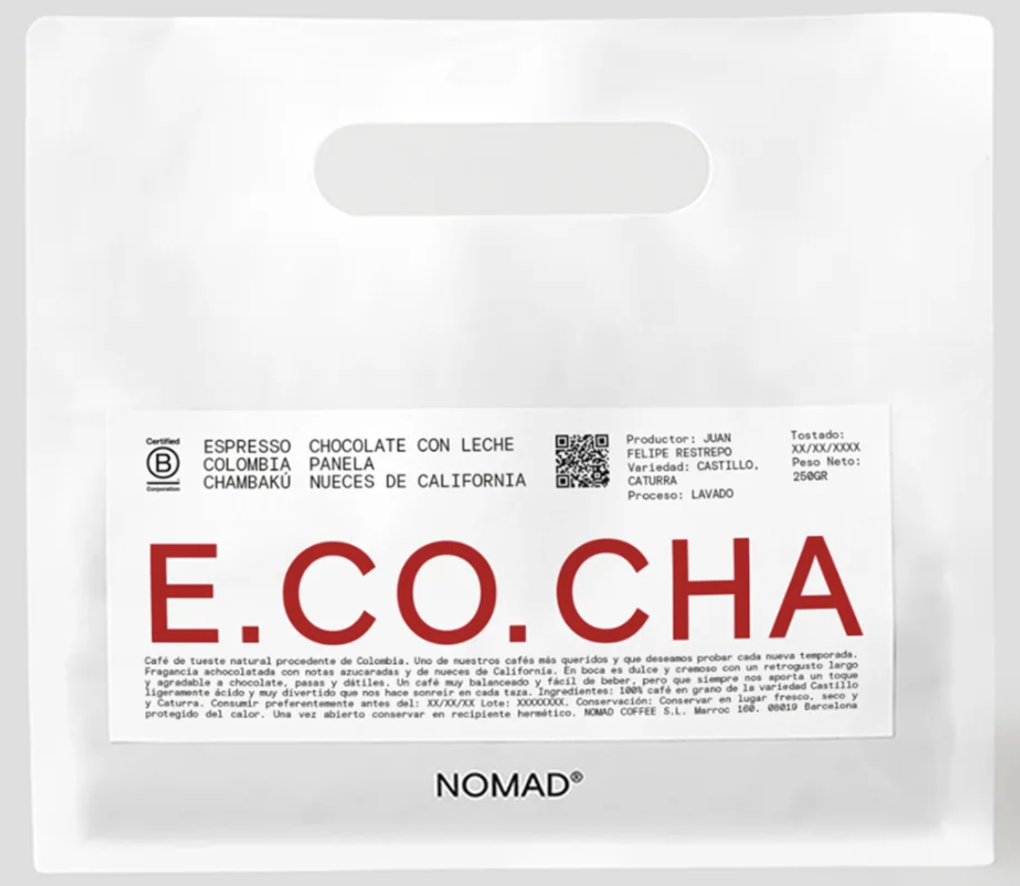
NOMAD E.CO.CHA Colombia Chambaku coffee pouch
A soft matte-white pouch is treated like a clinical product sample: translucent material, rounded die-cut handle, and a centered rectangular label organized with strict informational hierarchy. The design relies on a cool white field, tiny black technical text, a QR code, certification mark, and a large red monospaced wordmark that dominates the lower half. The overall feel is restrained, precise, and laboratory-like, mixing specialty-food craft with modernist systems design.
Visual index
Form rounded rectangle pouchdie-cut pill-shaped handlemonospaced uppercase letteringmodular label gridoversized typographic focal point
Mood precisequietpremiumlaboratory-likeminimal
Color matte white and off-white fielddeep red typographic accentsmall black technical textlow-contrast gray shadows
Texture soft translucent plastic or compostable pouchsmooth printed paper labelslight crinkling and diffuse shadowsclinical matte finish
Composition centered product framingrectangular label within broad negative spacestrong horizontal bandslarge wordmark anchored near bottommicro-information arranged in grid blocks
Related images
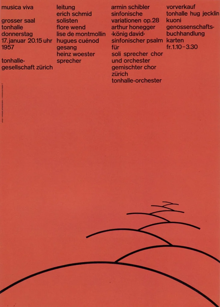
socks-studio.comcompositional relationship
Swiss International Typographic Style
Josef Müller-Brockmann’s concert posters for the Tonhalle Zürich and Musica Viva series
Look at how small text modules, generous blank space, and one dominant typographic element create order and authority without decorative imagery.
Shared strict grid structure, large typographic focal point, wide negative space, rational information hierarchy
Different poster scale, more dynamic geometric layouts, brighter graphic contrast
Image search
Josef Müller-Brockmann Musica Viva Tonhalle Zürich poster typography grid
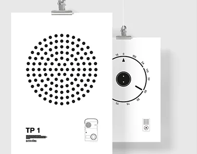
behance.netcultural lineage
Dieter Rams era Braun minimalism
Braun product graphics and packaging associated with Dieter Rams and the Ulm School design culture
Attend to the restraint of the surface, the small calibrated typography, and the way the object looks more engineered than decorated.
Shared white technical surface, functional labeling, minimal color use, industrial precision
Different consumer electronics context, hard plastic and metal materials, less expressive headline typography
Image search
Braun Dieter Rams white product design typography controls
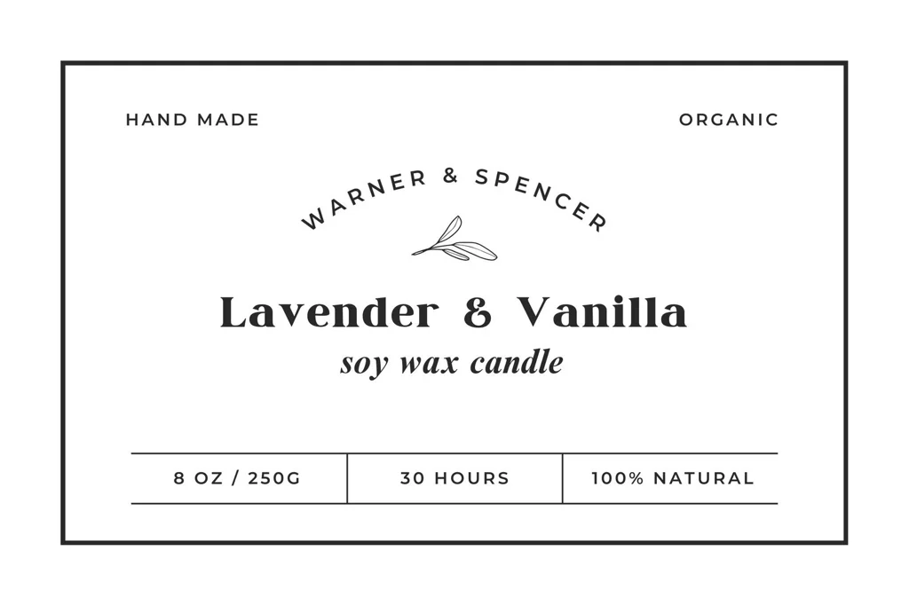
canva.commaterial kinship
MUJI no brand packaging
MUJI household and food packaging with plain labels and neutral material palettes
Notice the anti-glossy restraint, the neutral background, and the way plainness itself becomes the branding strategy.
Shared unbranded-feeling restraint, matte neutral materials, small black labeling, quiet retail presence
Different warmer craft-paper variants common in MUJI, usually less oversized display type, more everyday utility tone
Image search
MUJI minimalist white food packaging label typography
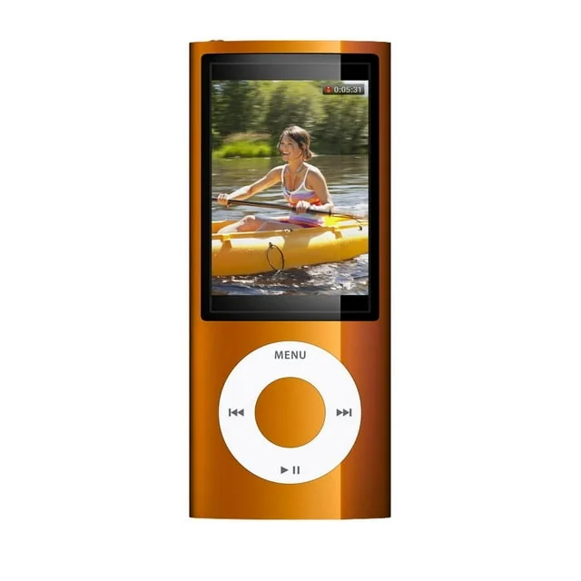
walmart.comcolor relationship
Apple white packaging minimalism
Apple iPod and early iPhone retail boxes with white surfaces and sparse product information
Focus on the polished whiteness, centered presentation, and the conversion of empty space into a premium design cue.
Shared dominant white field, premium minimalism, controlled brand placement, clean frontal presentation
Different glossier finish, photographic product imagery, more symmetrical consumer-tech packaging
Image search
Apple iPod classic white retail box minimalist packaging
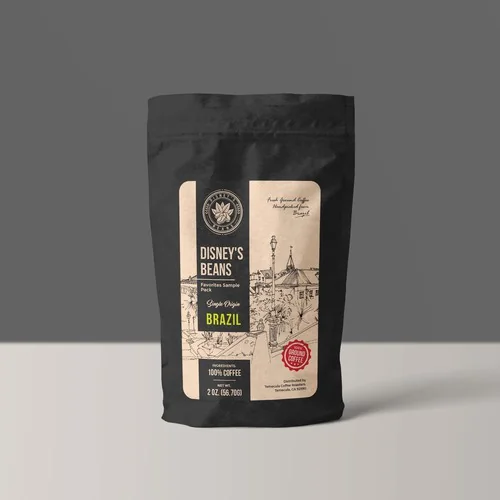
99designs.comcultural lineage
Specialty coffee minimal label systems
Blue Bottle Coffee bag labels and retail coffee packaging
Look for origin data, roast information, small certification or traceability marks, and the way a coffee bag becomes a compact information architecture.
Shared coffee provenance data, minimal bag presentation, small technical text, premium restraint
Different more illustrative brand icon use, often warmer paper tones, less stark red typographic emphasis
Image search
Blue Bottle Coffee whole bean bag minimalist label origin information
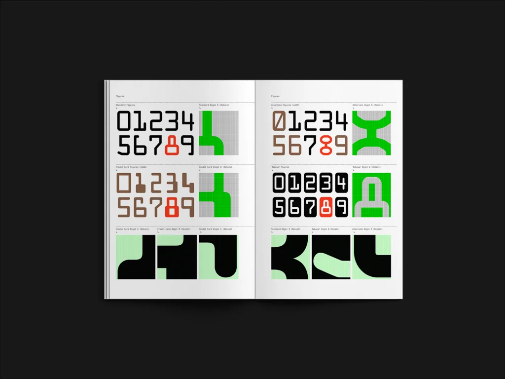
type-01.comtypographic relationship
Monospaced technical typography
OCR-B and typewriter-like information labeling used on tickets, forms, and machine-readable documents
Pay attention to the equal-width characters, squared rhythm, and the way typography suggests data, traceability, and precision.
Shared monospaced letterforms, technical data tone, machine-label rhythm, compact uppercase text
Different document and ticket origins, usually black-only printing, less lifestyle branding
Image search
OCR-B monospaced type specimen machine readable typography