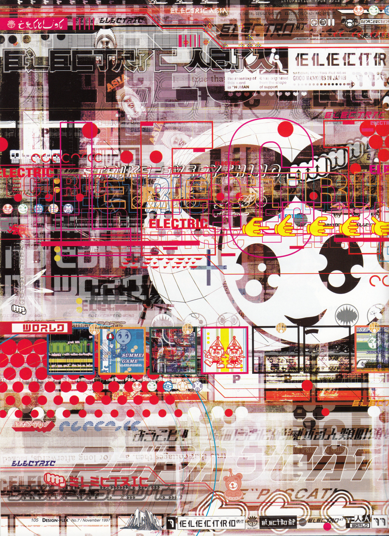
Electric Asia Design-Plex No.77
A dense techno-collage built from translucent layers of signage, Japanese and Latin typography, pictograms, mascot fragments, circuit-like lines, and transport-map geometry. The visual feel is fast, urban, and overloaded: red, black, white, and magenta elements stack like screen graphics, packaging, stickers, and club flyers compressed into one surface. The layout rejects hierarchy in favor of sampled information, overprinting, hard-edged vector forms, and a late-1990s digital-commercial mood.
Visual index
Form bold modular letterformspictograms and cartoon handsJapanese signage-inspired typeinterface-like framescircuits, arrows, dots, and transit-map curves
Mood hyperactiveurbantechno-commercialplayful but abrasivelate-1990s futuristic
Color high-contrast red, black, and whitemagenta lineworksmall yellow and cyan accentswashed beige/gray print undertonesoverprinted transparency effects
Texture screenprint-like overprinthalftone and photocopy residuetransparent digital layerscompressed poster/flyer surfacevisual noise from tiny text and symbols
Composition maximal all-over densitylayered typographic fieldsasymmetrical grid fragmentsdiagrammatic circles and routescollaged micro-panels and icons
Related images
amazingames.chcultural lineage
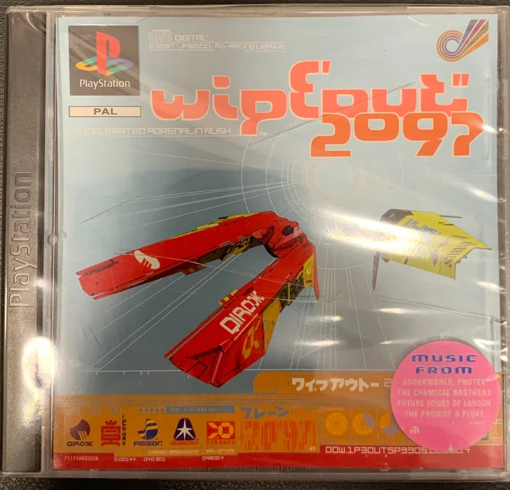
PlayStation era techno graphic identity
The Designers Republic, WipEout 2097 packaging and interface graphics, 1996
Look at how tiny logos, warning labels, geometric route lines, and aggressive italic lettering create the feeling of a branded future system rather than a conventional poster.
Shared techno signage density, faux-corporate icon systems, Japanese-influenced lettering, red-black-white contrast, interface-like micrographics
Different WipEout is more controlled and aerodynamic, stronger racing-game spatial cues, cleaner logo hierarchy
Image search
WipEout 2097 The Designers Republic PlayStation packaging front cover
eyemagazine.comtypographic relationship
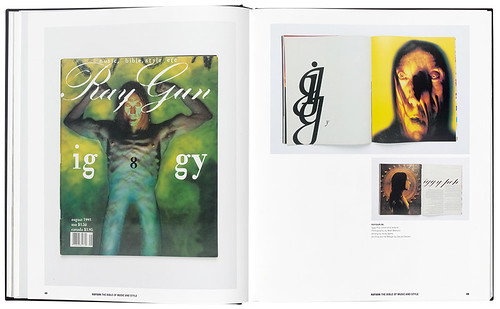
Early digital anti design typography
David Carson, Ray Gun magazine layouts, especially mid-1990s music features
Attend to the way type is broken, stretched, layered, partially obscured, and used as a field of marks rather than a calm vehicle for reading.
Shared illegible type as texture, layered editorial fragments, distressed print energy, asymmetric composition
Different Ray Gun often uses photographic portraiture, more grunge than techno, less Japanese signage influence
Image search
David Carson Ray Gun Bryan Ferry Zapf Dingbats spread 1994
moma.orgcultural lineage
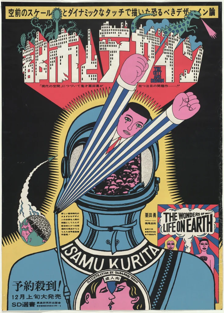
Postmodern Japanese poster density
Tadanori Yokoo, The City and Design: The Wonders of Life on Earth, 1966
Notice the packed surface, symbolic overload, abrupt scale shifts, and the way popular visual material is arranged as a theatrical field rather than a clean information system.
Shared dense all-over composition, red graphic emphasis, Japanese commercial references, pop-symbolic layering
Different Yokoo is more psychedelic and illustrative, warmer handmade poster sensibility, less digital-interface geometry
Image search
Tadanori Yokoo The City and Design The Wonders of Life on Earth 1966 poster
moma.orgmedium reference
Early desktop publishing collage
April Greiman, Does it make sense?, Design Quarterly 133, 1986
Focus on the visible layering of image, type, grids, and digital artifacts; the surface reads as a constructed screen-space rather than a flat traditional poster.
Shared digital layering, diagrammatic overlays, fragmented typography, hybrid print-screen texture
Different Greiman uses more open space, more body-image centered, softer color transitions
Image search
April Greiman Does it make sense Design Quarterly 133 foldout poster
hypebeast.comformal echo
Superflat consumer pop language
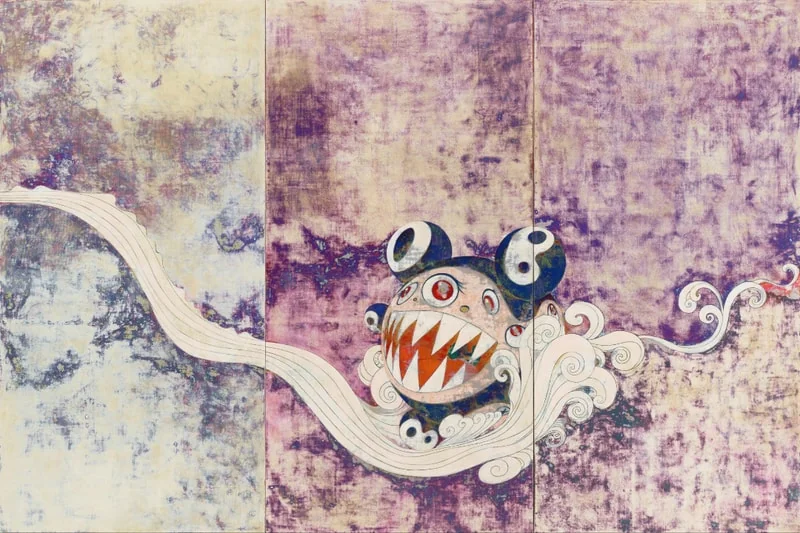
Takashi Murakami, Mr. DOB character works, 1990s
Look for the flatness of cartoon forms, the hard outlines, the cheerful-commercial surfaces, and the way cuteness is embedded inside a busy consumer information field.
Shared kawaii mascot fragments, flat outlined shapes, consumer-pop references, bright red accents
Different Murakami is cleaner and more character-focused, less typographic congestion, more painterly/pop-art context
Image search
Takashi Murakami Mr DOB 1996 painting
publicdelivery.orgcolor relationship
Red white black agitprop typography
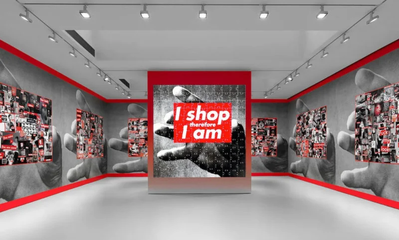
Barbara Kruger, Untitled (I shop therefore I am), 1987
Compare the punch of red rectangles, black-and-white contrast, and declarative type; then note how the uploaded image disperses that force across many competing signals.
Shared red-white-black palette, commercial graphic urgency, bold type blocks, appropriated consumer language
Different Kruger is more minimal and slogan-based, uses photographic central imagery, clearer political address
Image search
Barbara Kruger I shop therefore I am 1987 artwork