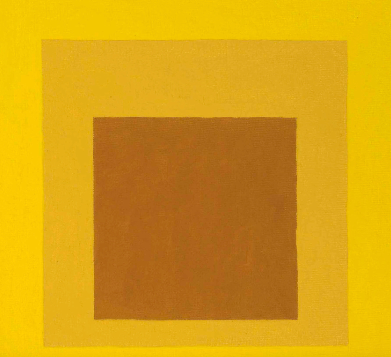
Homage to the Square series
A quiet, centered field of nested squares uses close-valued yellows, ochres, and warm browns to create a slow optical pulse. The composition is rigidly frontal and geometric, but the brushed, woven surface softens the edges and makes the color feel atmospheric rather than mechanical. Its mood is meditative, analytical, and sun-warmed, with subtle shifts in saturation doing most of the expressive work.
Visual index
Form hard-edged geometry softened by paintconcentric rectangular fieldsflat picture planeminimal spatial illusionmodular proportion
Mood meditativerestrainedwarmopticalcontemplative
Color cadmium yellow fieldmuted golden ochrewarm burnt umberlow-contrast tonal progressionsunlit monochrome palette
Texture visible canvas weavedry brushed pigmentslightly feathered edgesmatte painted surfacesubtle unevenness of hand application
Composition nested square formatcentral alignmentbroad outer marginrectilinear stackingbalanced frontal plane
Related images
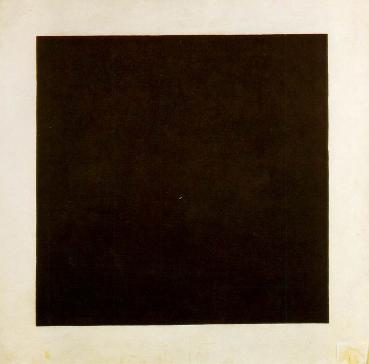
tate.org.ukformal echo
Suprematist square abstraction
Kazimir Malevich, Black Square, 1915
Look at how a simple centered square can carry the whole composition, making edge, proportion, and surrounding field feel charged rather than empty.
Shared central square motif, reduced geometric vocabulary, flat frontal plane, emphasis on edge tension
Different black-and-white severity, icon-like symbolism, less chromatic modulation, rougher historical avant-garde facture
Image search
Kazimir Malevich Black Square white ground
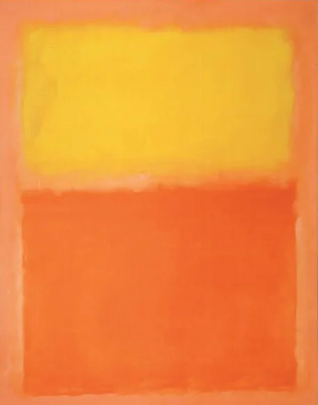
WikiArt.orgcolor relationship
Color Field painting
Mark Rothko, Orange and Yellow, 1956
Notice the way adjacent warm hues seem to glow into one another, and how soft transitions can make flat rectangles feel atmospheric.
Shared warm yellow-orange range, soft optical glow, rectangular color fields, contemplative stillness
Different looser floating forms, larger atmospheric scale, more emotional brushwork, vertical stacked layout
Image search
Mark Rothko Orange and Yellow 1956
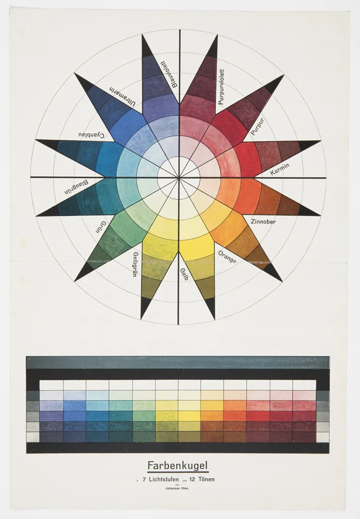
Cooper Hewittcultural lineage
Bauhaus color theory
Johannes Itten, color sphere and contrast studies from The Art of Color
Focus on how small shifts in value and saturation change the perceived size, depth, and temperature of each square.
Shared systematic color comparison, pedagogical clarity, restricted palette, attention to simultaneous contrast
Different diagrammatic presentation, broader theoretical range, less emphasis on painterly texture, often uses multiple hues
Image search
Johannes Itten color sphere Bauhaus
bluewin.chperiod relationship
Concrete art modular color systems
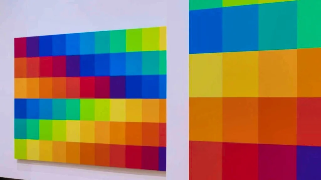
Richard Paul Lohse, serial color-square compositions, 1940s–1960s
Compare the disciplined geometry and controlled palette, especially how color decisions appear rule-based rather than illustrative.
Shared geometric order, nonrepresentational color structure, rectangular modules, analytical restraint
Different multi-unit grid systems, cooler industrial precision, sharper edges, less painterly surface
Image search
Richard Paul Lohse serial color squares
kasmingallery.comformal echo
Minimalist hard edge painting
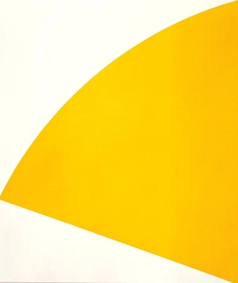
Ellsworth Kelly, Yellow Curve, 1990
Look for how a single dominant color can define the viewer's spatial experience even when the form is extremely simple.
Shared dominant yellow field, reductive geometry, color as primary subject, minimal compositional means
Different curved shaped form, object-like installation scale, cleaner industrial surface, less nested structure
Image search
Ellsworth Kelly Yellow Curve 1990
tate.org.ukmaterial kinship
Woven modernist abstraction
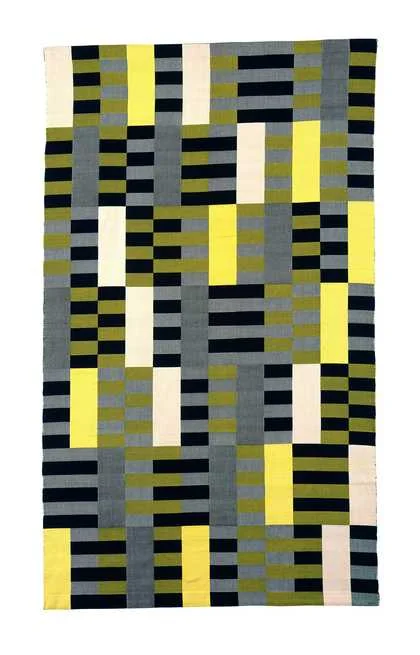
Anni Albers, wall hangings and pictorial weavings, 1920s–1960s
Attend to the tiny surface irregularities: the weave, dry edges, and slight tonal breaks make strict geometry feel handmade.
Shared woven surface feeling, rectilinear geometry, muted earth-warm palette, handcrafted irregularity
Different actual textile construction, patterned repeat structures, more linear detail, fiber-based relief
Image search
Anni Albers yellow brown wall hanging
contrast reference
Ad Reinhardt geometric reduction
Ad Reinhardt, Abstract Painting series, 1960s
Notice how minimal tonal changes become active when the composition offers almost no image beyond proportion, field, and edge.
Shared near-monochrome structure, strict square format, quiet optical demands, reduced composition
Different dark near-black palette, more severe austerity, less warmth, more hidden internal divisions
Image search
Ad Reinhardt black abstract painting squares