Pixelated OK Dialog Loop
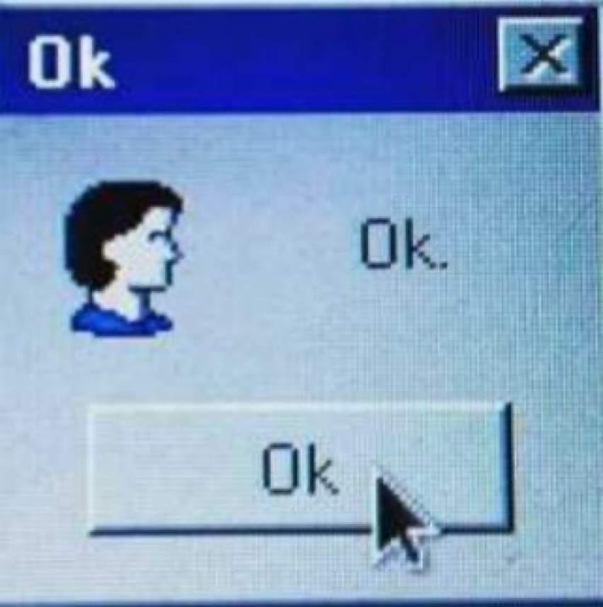
A low-resolution desktop dialog fills the frame with a saturated cobalt title bar, pale gray system-panel body, and beveled rectangular button. The composition is extremely sparse and deadpan: repeated “Ok” labels, a small profile icon, and a large black cursor create a recursive, almost absurd interface moment. CRT-like scan texture, compression blur, and hard-edged pixel typography give it a late-1990s operating-system feel, where functional UI elements become the whole visual language.
Visual index
Form rectangular window frameraised 3D buttonbitmap textsmall system icontriangular mouse pointer
Mood deadpanbureaucraticabsurdnostalgiclo-fi
Color cobalt blue title barpale gray window chromeblack cursor and textoff-white button highlightmuted blue shadowing
Texture visible pixel gridCRT moiréJPEG-like bluraliased edgesbeveled UI shading
Composition single centered dialog windowlarge empty negative spacestacked title-message-button hierarchyright-weighted cursor emphasisrepetition of the same short word
Related images
Wikimedia Commonsperiod relationship
Microsoft Windows 95 system dialogs
Microsoft Windows 95 standard message box interface
Look at the hard blue title strip, the chiseled button edges, and the way hierarchy is created through simple rectangular zones rather than illustration or ornament.
Shared blue title bar, gray dialog body, beveled OK button, bitmap system typography, modal window layout
Different more absurd text repetition, heavier image degradation, cropped meme-like framing
Image search
Microsoft Windows 95 message box blue title bar
imjustcreative.comcultural lineage
Susan Kare early Macintosh icon language
Susan Kare’s icons for the original Apple Macintosh system software
Focus on how facial features, silhouettes, and controls are reduced to blocky, high-contrast pixel marks that remain legible at tiny scale.
Shared small bitmap figure, economical facial outline, low-resolution icon logic, high-contrast pixel drawing
Different Macintosh was usually monochrome, more refined icon authorship, less beveled window styling
Image search
Susan Kare Macintosh smiling computer icon
Wikimedia Commonscultural lineage
Xerox Star desktop metaphor
Xerox Star 8010 graphical user interface
Attend to the logic of framed workspaces, pointer-based selection, and the idea that a small rectangular box can interrupt the whole screen as an authoritative system message.
Shared window frame logic, pointer interaction, office-like interface metaphor, rectangular information containers
Different earlier monochrome display, more document-centered layout, less consumer-PC color styling
Image search
Xerox Star 8010 desktop icons
GitHubformal echo
IBM OS 2 Presentation Manager
IBM OS/2 Warp Presentation Manager dialog boxes
Compare the shallow 3D bevels and sober corporate palette, especially how buttons look like physical plastic pieces embedded in the screen.
Shared raised button geometry, gray system palette, businesslike interface tone, modal dialog structure
Different often cleaner rendering, different type metrics, less meme-like repetition
Image search
IBM OS/2 Warp message box
MacSales.commedium reference
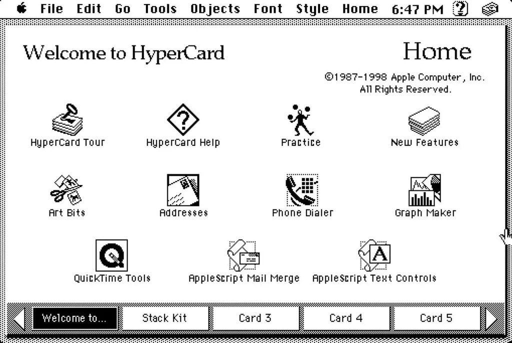
Apple HyperCard interface vernacular
Apple HyperCard stacks with rectangular buttons and bitmap text
Notice how a flat screen becomes a set of clickable zones, with typography and button outlines doing nearly all of the compositional work.
Shared button-centered interaction, minimal screen layout, bitmap text, plain rectangular controls
Different HyperCard was commonly monochrome, more card-like composition, less operating-system chrome
Image search
Apple HyperCard button stack interface
material kinship
Early net art browser era glitch aesthetics
JODI.org early web interface disruptions
Look for the tension between functional UI and visual breakdown: repeated labels, misdirected attention, coarse pixels, and the sense that the system is speaking nonsense.
Shared interface as subject, lo-fi screen texture, absurd system language, digital artifacting
Different JODI is more chaotic, often web-browser based, more intentionally disruptive composition
Image search
JODI.org early net art interface