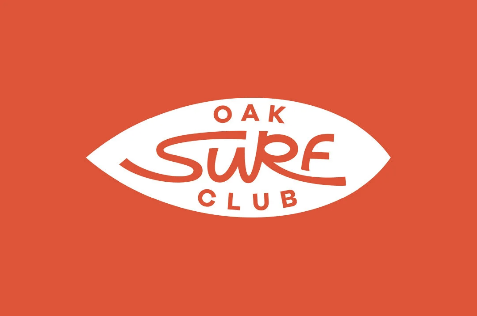
Oak Surf Club logo
A crisp, flat-vector logo sits centered on a saturated tomato-orange field. The composition is built around a white almond-shaped surfboard or eye-like capsule, containing red lettering with a loose mid-century surf-script wordmark and spaced uppercase sans-serif text above and below. The mood is sunny, casual, retro, and coastal, with minimal texture, high contrast, and a clean badge-like layout suited to stickers, apparel, or club signage.
Visual index
Form almond-shaped capsulecustom flowing scriptspaced uppercase letterselongated horizontal proportionssimple emblem geometry
Mood retro coastalcasual club identitysunny and recreationalnostalgic surf-shop feel
Color saturated tomato orangeclean white negative shapematching red-orange typographyhigh-contrast two-color palette
Texture flat vector surfaceno visible graincrisp edgesscreen-print-like simplicity
Composition centered badge layoutlarge surrounding color fieldhorizontal almond/surfboard silhouettestacked wordmark hierarchysymmetrical enclosure
Related images
westcoastsailing.netcultural lineage
1960s California surfboard decal lettering
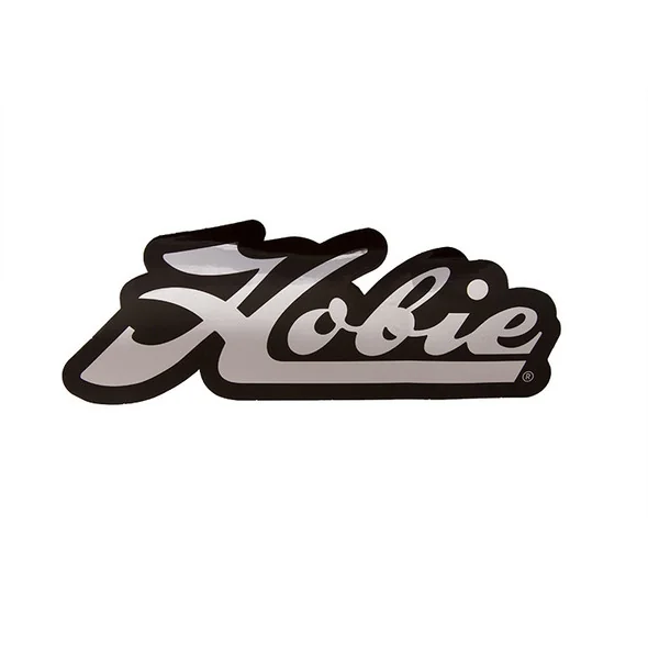
Hobie Surfboards classic script logo
Look at the long, smooth letter connections, the casual baseline, and the way the script feels fast and wave-like rather than formal or calligraphic.
Shared flowing custom script, surf-culture association, horizontal wordmark emphasis, casual hand-lettered energy
Different Hobie uses a standalone black script more often, less enclosed badge geometry, more established brand-signature feel
Image search
Hobie Surfboards classic script logo decal
moma.orgcolor relationship
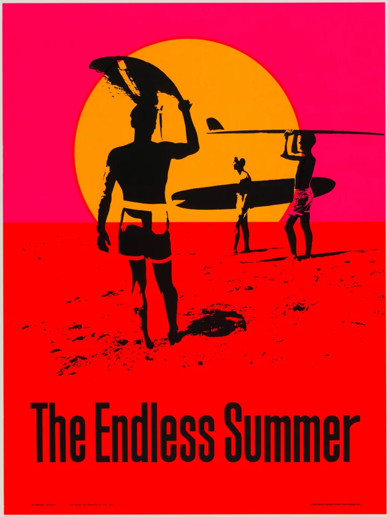
Pop surf poster color blocking
John Van Hamersveld poster for The Endless Summer, 1966
Notice the reliance on warm, saturated color fields and simple silhouettes to create an immediate beach-culture mood without photographic detail.
Shared warm orange palette, flat graphic treatment, surf-culture nostalgia, bold simplified forms
Different poster includes figures and landscape, more multicolor composition, illustrative rather than logo-based
Image search
The Endless Summer 1966 John Van Hamersveld original poster orange
vintageclothingguides.comperiod relationship
Surf apparel badge minimalism
Hang Ten footprint logo and 1960s surfwear branding
Focus on how a small number of bold shapes can carry an entire lifestyle identity, especially when designed for patches, tags, decals, and T-shirts.
Shared simple emblem structure, surfwear identity, limited-color reproduction, casual recreational tone
Different Hang Ten is pictorial rather than typographic, uses feet iconography, less script-driven
Image search
vintage Hang Ten footprint logo surfwear label

gettyimages.comtypographic relationship
Mid century commercial script signage
Raymond Loewy-era American product and service-station script branding
Attend to the thick-to-thin curves, the broad swash-like movement, and the way the lettering feels designed as a sign rather than typed from a font.
Shared custom script lettering, friendly commercial tone, streamlined curves, bold two-color readability
Different less coastal in subject matter, often more polished corporate finish, may include metallic or dimensional effects
Image search
mid century red white script service station logo signage
picclick.comformal echo
Surfboard maker oval decals
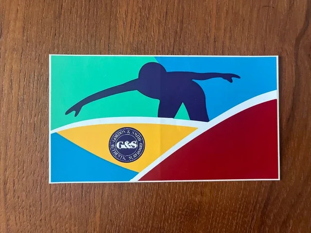
Gordon & Smith Surfboards vintage oval and script decals
Look for the enclosed oval or capsule forms, centered brand names, and the balance between clean geometry and looser hand lettering.
Shared enclosed badge shape, script-oriented surf branding, board-decal readability, compact horizontal layout
Different often more detailed or multicolor, brand names vary in density, some decals use shields or crests
Image search
vintage Gordon and Smith surfboards oval script decal
cultural lineage
Southern California skate surf logo crossover
Santa Cruz Skateboards classic red dot logo by Jim Phillips
Compare the compactness of the mark, the sticker-like presence, and the confidence of a high-contrast emblem designed to reproduce at many sizes.
Shared West Coast action-sports identity, sticker-ready composition, bold color field, youth-culture branding
Different more aggressive skate tone, heavier block typography, not script-led
Image search
Santa Cruz Skateboards classic red dot logo Jim Phillips