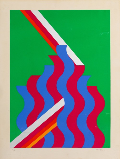
Wavy Hard-Edge Color Bands
A bright hard-edge composition built from flat, saturated fields and crisp graphic separations. A green rectangular ground holds vertical, ribbon-like waves in red and blue, interrupted by sharp diagonal bands of white, red, purple, and orange. The surface reads like a screenprint or poster: even ink, clean edges, slight paper margin, and a controlled optical rhythm. Its mood is buoyant and synthetic, balancing Op-art vibration with Pop-era color and late-1960s graphic confidence.
Visual index
Form sinuous vertical ribbonsgeometric diagonal slasheshard-edge abstractionrepetition with variationflat layered shapes
Mood energeticplayfulopticalsynthetic1960s-pop-inflected
Color saturated grass green fieldprimary red and blue wave bandswhite diagonal cutsorange and magenta accent stripeshigh-contrast flat color
Texture flat screenprint-like inkminimal visible brushworkclean hard edgesslight paper grain and margin agingposter-like surface
Composition central stacked wave patterndiagonal bands crossing the fieldrectangular image area within paper marginrepeating vertical rhythmasymmetrical interruption of pattern
Related images
davidzwirner.comformal echo
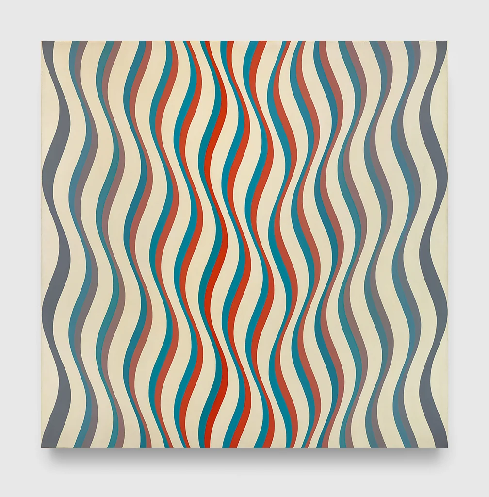
Op Art wave abstraction
Bridget Riley, Cataract 3, 1967
Look at how small shifts in the width and curvature of repeated stripes make the surface feel unstable, as if the flat picture plane is moving.
Shared undulating stripe rhythm, optical vibration, flat repeated bands, nonrepresentational movement
Different Riley’s restrained palette, finer line density, less Pop-poster color
Image search
Bridget Riley Cataract 3 1967 painting
period relationship
Hard edge Pop abstraction
Nicholas Krushenick, 1960s hard-edge screenprints and paintings
Notice the thick, cleanly separated color shapes, the bright commercial palette, and the way curves are treated as graphic signs rather than natural forms.
Shared hard-edge color separation, Pop-era saturation, curving abstract shapes, screenprint-like flatness
Different often heavier black contouring, more cartoon-like interlocking forms, less diagonal stripe structure
Image search
Nicholas Krushenick red blue green hard edge abstraction 1960s
1stdibs.comcultural lineage
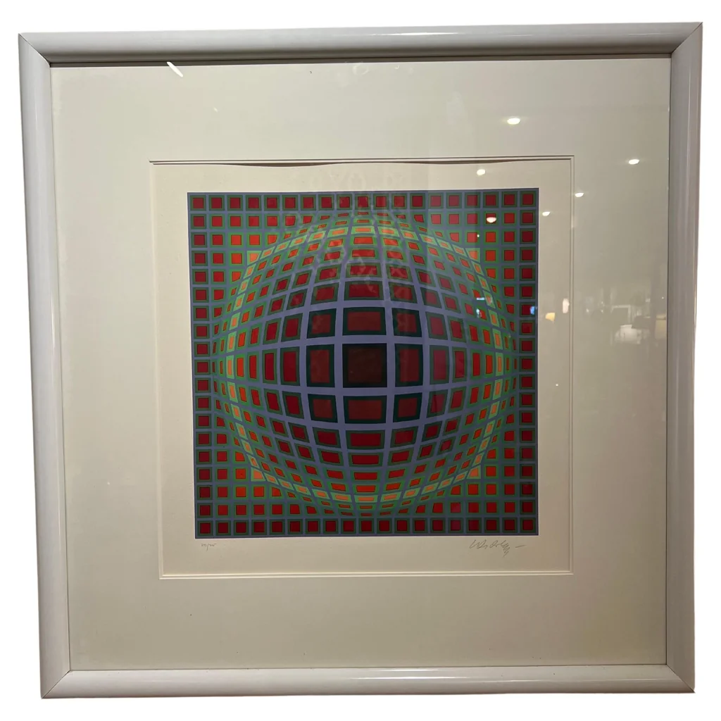
Kinetic and optical color systems
Victor Vasarely, Vega series, late 1960s
Attend to how repetition and systematic curvature produce the illusion of expansion, compression, or spatial vibration on a flat surface.
Shared optical distortion, systematic repetition, bright geometric abstraction, 1960s kinetic-art context
Different more mathematical grid structure, stronger illusion of volume, less poster-like informality
Image search
Victor Vasarely Vega series optical art
fineartamerica.comcompositional relationship
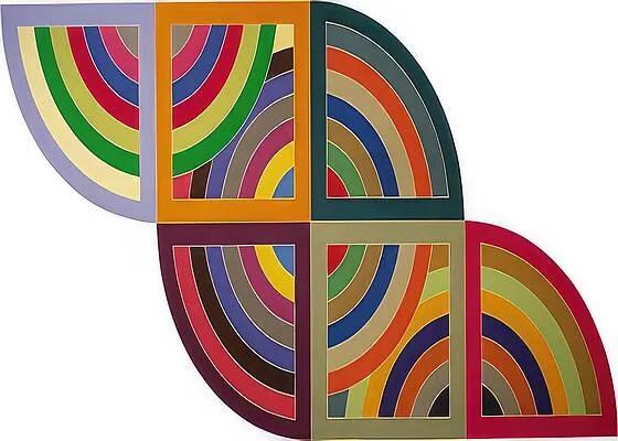
Frank Stella Protractor era color geometry
Frank Stella, Harran II, 1967
Compare the structural role of colored bands: they behave like architectural tracks, defining rhythm, direction, and pressure across the surface.
Shared crisp hard-edge bands, saturated color, abstract geometric structure, flat modernist surface
Different more architectural arcs, larger scale painting context, less wavy optical repetition
Image search
Frank Stella Harran II 1967 Protractor painting
bahrgallery.comcultural lineage
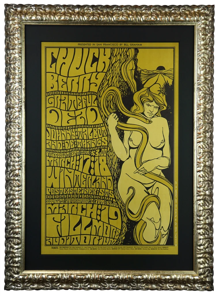
Psychedelic poster color
Wes Wilson and Bill Graham Fillmore concert posters, 1966–1968
Look for elastic curves, saturated oppositional colors, and the sense that forms are stretching or vibrating across the page.
Shared high-key color, wavy graphic rhythm, poster-like flatness, 1960s visual energy
Different no dense lettering, more abstract and orderly, cleaner hard-edge geometry
Image search
Wes Wilson Fillmore psychedelic poster 1967 wavy lettering
classic-modern.co.ukmaterial kinship
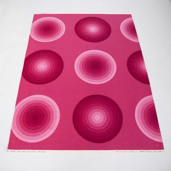
Space Age textile graphics
Verner Panton, Mira-X geometric textile designs, late 1960s–1970s
Notice how decorative repetition can become spatial and environmental, turning simple waves and stripes into an all-over visual field.
Shared repeating wave motifs, bold synthetic palette, decorative modernism, flat graphic color
Different designed for fabric and interiors, often more all-over patterning, warmer 1970s color schemes
Image search
Verner Panton Mira-X wavy stripe textile design
tate.org.ukmedium reference
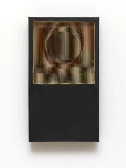
Latin American kinetic color
Carlos Cruz-Diez, Physichromie works, 1960s
Focus on how narrow color intervals and directional bands activate the eye, making color feel like an event rather than a filled-in shape.
Shared perceptual color emphasis, stripe-based structure, kinetic visual energy, clean modernist execution
Different more relief-based construction, viewer-dependent color shifts, less Pop-graphic wave shape
Image search
Carlos Cruz-Diez Physichromie 1960s stripe work