Blurred SIX Swoosh Wordmark
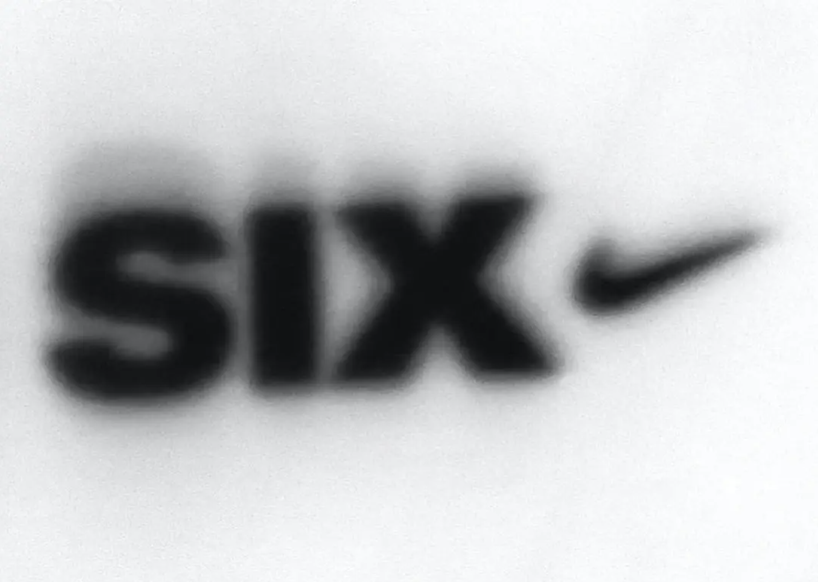
A soft-focus black wordmark sits low and left on a pale gray-white field, with heavy rounded letters dissolving into a smoky halo. The composition is sparse and cropped, using blur, grain, and high contrast to turn a commercial logo-like mark into something closer to photocopied streetwear ephemera or an enlarged screenprint detail. The mood is stripped-down, urban, and slightly anonymous, with the Nike-like swoosh acting as a sharp cultural cue despite the intentionally degraded rendering.
Visual index
Form bold rounded sans-serif letterscorporate swoosh silhouettesoftened block typographyminimal emblematic mark
Mood anonymousstreetwear-codedindustrialcompressed and lo-ficoolly branded
Color black on off-whitegrayscale minimalismsoft gray shadowinghigh contrast
Texture blurred ink edgesphotocopy-like grainsoft airbrushed halomatte paper or fabric feel
Composition large cropped wordmarkleft-weighted layoutwide empty negative spacehorizontal logo lockup
Related images
sjathevoice.orgcultural lineage
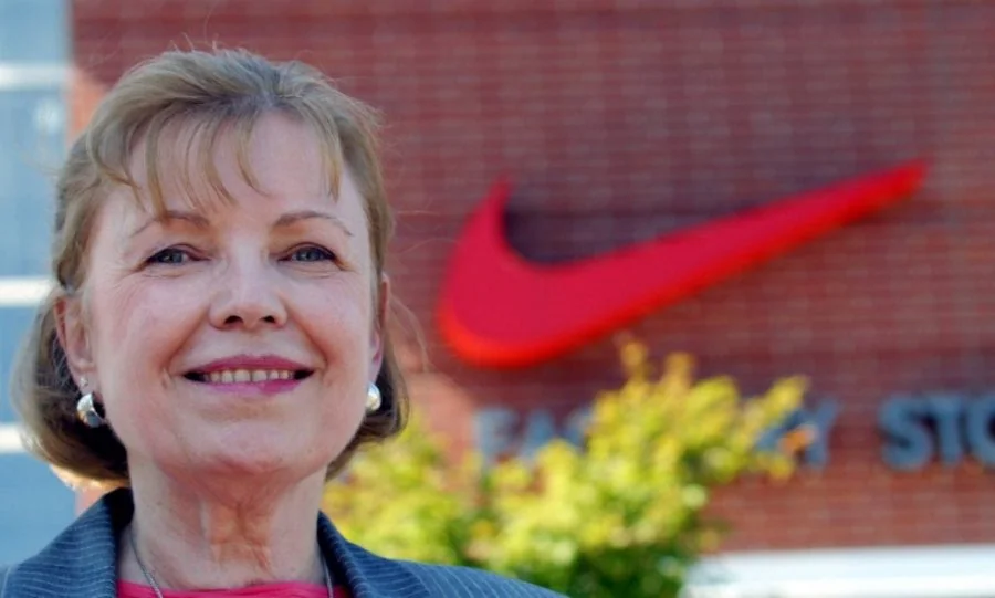
Nike corporate identity
Carolyn Davidson’s Nike Swoosh logo
Look at how a very simple curved wedge can carry brand recognition even when blurred, cropped, or separated from supporting text.
Shared black swoosh silhouette, minimal athletic branding, horizontal logo placement, strong figure-ground contrast
Different clean vector edges, standalone corporate mark, less degraded texture
Image search
Carolyn Davidson Nike Swoosh logo
typographic relationship
Nike Futura wordmark era
Nike Futura Bold wordmark lockups from the 1970s and 1980s
Notice the weight of the letters, the compressed visual rhythm, and the way the type is treated as a blocky graphic mass rather than delicate lettering.
Shared heavy sans-serif lettering, black monochrome branding, sportswear association, compact horizontal lockup
Different more legible typography, crisper production, official brand proportions
Image search
Nike Futura Bold wordmark logo
StockXcultural lineage
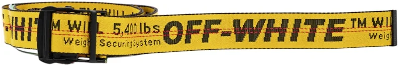
Virgil Abloh industrial streetwear graphics
OFF-WHITE c/o Virgil Abloh industrial text graphics
Focus on the use of plain black type, direct labeling, and the transformation of commercial marks into fashion-coded visual fragments.
Shared monochrome graphic treatment, streetwear branding language, text as surface mark, industrial plainness
Different quotation-mark conventions absent, diagonal stripe system absent, less conceptual labeling
Image search
Virgil Abloh OFF-WHITE industrial text
publicdelivery.orgformal echo
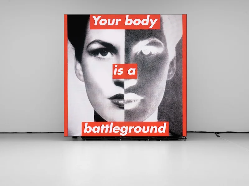
Barbara Kruger high contrast text graphics
Barbara Kruger’s black, white, and red text-based works
Attend to the way large text becomes image: scale, contrast, and cropping make the word operate as a graphic object before it is read semantically.
Shared large typographic mass, stark contrast, text as image, cropped immediacy
Different no red field, no slogan structure, softer blurred edges
Image search
Barbara Kruger Untitled Your Body
National Gallery of Artcompositional relationship
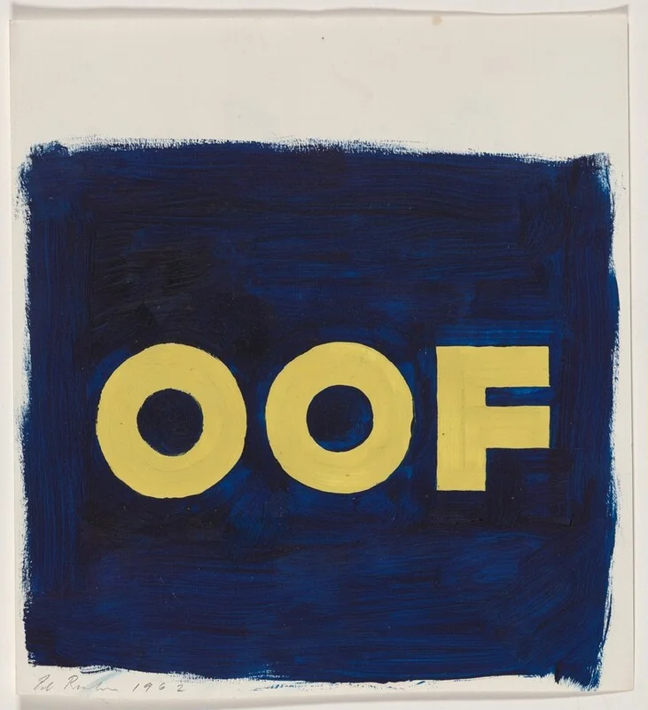
Ed Ruscha word paintings
Ed Ruscha’s single-word paintings and drawings
Look at the empty space around the word and how the lettering becomes a shape with atmosphere, not merely a message.
Shared single-word emphasis, large empty background, graphic lettering, deadpan presentation
Different less painterly composition, corporate logo element present, blurred photographic degradation
Image search
Ed Ruscha OOF word painting
picclick.co.ukmedium reference
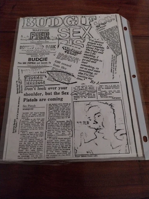
Photocopied punk flyer graphics
1970s–1980s punk show flyers with xeroxed black type
Notice the tonal fuzz around the black shapes, the uneven gray field, and the sense that the image has passed through mechanical reproduction.
Shared black-and-white reproduction, degraded edges, grainy surface, low-fidelity graphic punch
Different less collage density, no hand-cut layout, more corporate sportswear cue
Image search
Sex Pistols xerox punk flyer