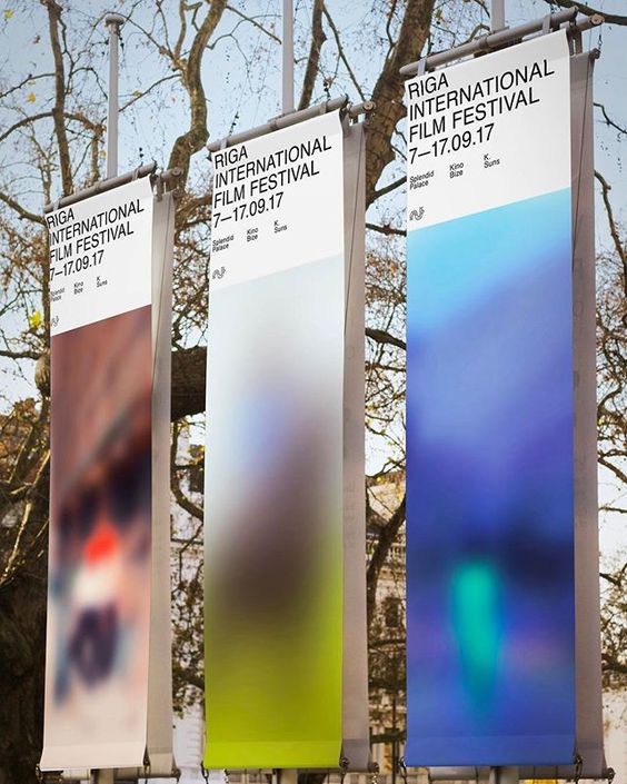
Riga International Film Festival 2017 outdoor banner campaign
A set of tall outdoor banners pairs a strict white typographic header with large, soft-focus color fields below. The visual feel is contemporary institutional design: restrained black sans-serif typography, generous negative space, and blurred image panels that read like decontextualized film stills or digital light leaks. The composition depends on vertical repetition, modular hierarchy, and a contrast between rational grid order and atmospheric, almost abstract color.
Visual index
Form rectangular hanging bannersstrict grid structurecondensed sans-serif text blockslarge abstract color planesminimal hierarchy of event information
Mood cool institutional clarityurban cultural polishcinematic ambiguityquietly futuristicrestrained and atmospheric
Color black-on-white typographic headerscool blue and cyan gradientsmuted lime and violet hazewarm reddish blur accentshigh-key daylight neutrality
Texture soft photographic blursmooth printed vinyldigital gradient hazeoutdoor banner materialdiffused light transitions
Composition tall vertical banner formatrepeated modular panelstop-heavy information blocklarge lower image fieldasymmetrical left-aligned typography
Related images
peoplesgdarchive.orgtypographic relationship
International Typographic Style
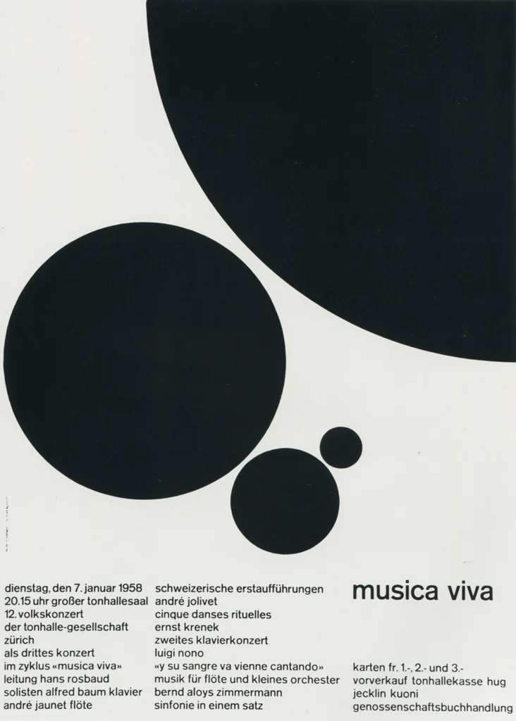
Josef Müller-Brockmann, Musica Viva concert posters, 1950s–1960s
Look at the left-aligned sans-serif blocks, the controlled spacing, and the way information is treated as a clean architectural element rather than decoration.
Shared left-aligned sans-serif type, strict information hierarchy, large negative space, institutional cultural context
Different geometric abstraction instead of blur, more mathematical composition, print poster rather than outdoor banner
Image search
Josef Muller Brockmann Musica Viva poster 1958 black red Swiss grid
stedelijk.nlformal echo
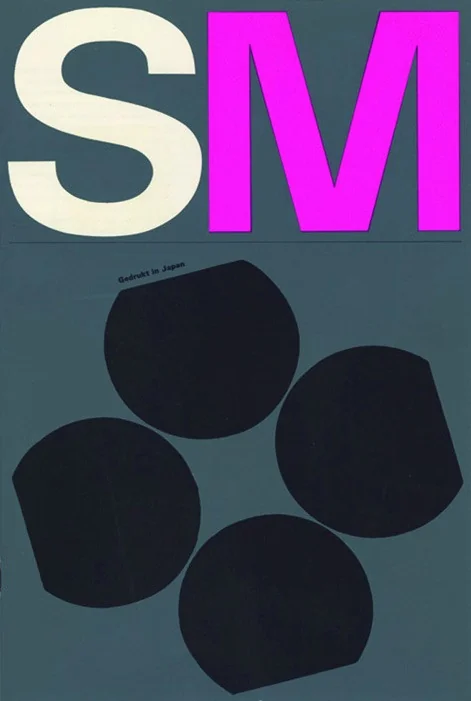
Wim Crouwel museum graphics
Wim Crouwel posters for the Stedelijk Museum, Amsterdam
Notice how the text behaves like a system: compact, aligned, and repeatable across formats, with the poster surface divided into clear zones.
Shared modular grid layout, black sans-serif typography, cultural-institution branding, repeatable poster system
Different Crouwel often used experimental letterforms, less atmospheric imagery, more graphic geometry
Image search
Wim Crouwel Stedelijk Museum exhibition poster typography grid

invaluable.comcultural lineage
Munich 1972 Olympic visual system
Otl Aicher, Munich 1972 Olympics signage and banners
Attend to the public-scale modularity: repeated vertical formats, economical typography, and the use of banners as part of a coordinated event environment.
Shared outdoor event graphics, vertical banner repetition, clean modernist hierarchy, public wayfinding sensibility
Different pictogram-based system, brighter standardized palette, sports-event context
Image search
Otl Aicher Munich 1972 Olympics vertical banners signage system

reddit.comcolor relationship
Digital blur interface aesthetics
Apple iOS 7 translucent blur interface, 2013
Look for the frosted-glass effect: saturated color is diffused into smooth gradients, while text remains sharp and functional above it.
Shared soft gradient color fields, digital blur effect, contrast of sharp type and haze, cool cyan-blue palette
Different interactive screen medium, rounded interface components, smaller-scale visual environment
Image search
Apple iOS 7 frosted glass blur colorful gradient interface
metmuseum.orgmaterial kinship
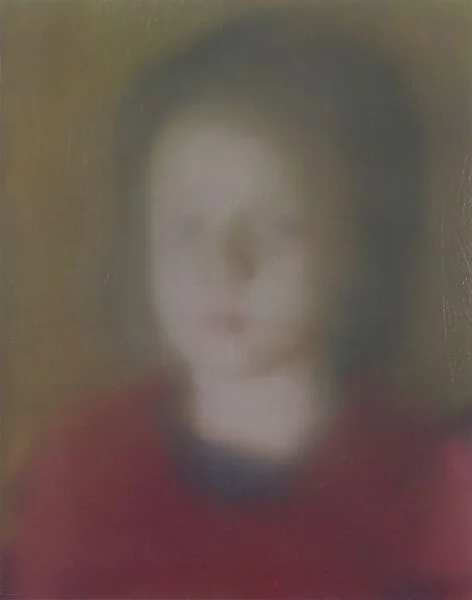
Gerhard Richter photographic blur
Gerhard Richter, Betty, 1988
Focus on the deliberate loss of clarity: edges dissolve, color patches remain, and the viewer senses an image without being allowed to fully read it.
Shared soft-focus ambiguity, diffused edges, image reduced to color masses, tension between recognition and abstraction
Different oil painting surface, single intimate figure, no typographic system
Image search
Gerhard Richter Betty 1988 blurred portrait painting
nga.govformal echo
Color Field abstraction
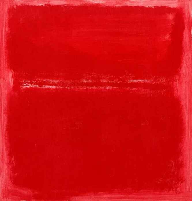
Mark Rothko, Untitled color field paintings of the 1950s
Notice the broad vertical fields, feathered transitions, and contemplative relation between saturated color and empty space.
Shared large vertical color areas, soft transitions, minimal compositional elements, atmospheric emotional tone
Different painted canvas rather than printed graphic, no event typography, more symmetrical devotional format
Image search
Mark Rothko 1950s soft edge color field painting vertical rectangles