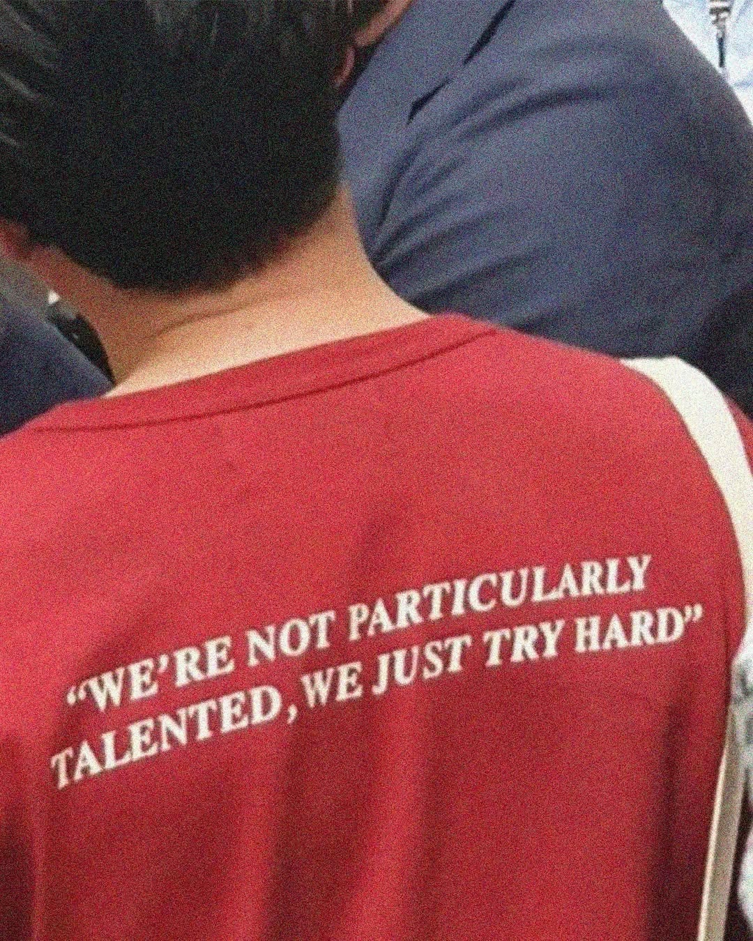
Candid red slogan back
A grainy, close-cropped snapshot turns a red T-shirt into a moving text surface. The composition is informal and compressed, with the wearer’s back filling the frame and the white uppercase serif slogan bending slightly with the fabric. The visual feel is candid, vernacular, and self-deprecating: bold enough to read like a public statement, but softened by low-resolution noise, body curvature, and everyday crowding.
Visual index
Form uppercase serif sloganwearable text blockcurved typographic planetwo-line quotation layoutminimal graphic system
Mood deadpanself-effacingcasualurban everydayanti-heroic
Color washed red fabric fieldwhite printed letteringdark navy and black surrounding clothingwarm skin toneslow-light digital noise
Texture soft cotton knitslightly cracked or blurred screenprintJPEG grainmotion-softened edgesmatte fabric surface
Composition tight cropped torsooff-center diagonal shoulder linetext placed across the lower backcrowded candid framingbody-as-poster layout
Related images
garmentory.comcultural lineage
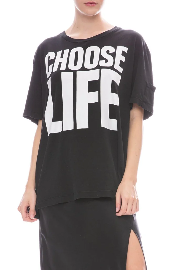
Slogan T shirt activism
Katharine Hamnett, CHOOSE LIFE T-shirt, 1980s
Look at how a blunt phrase gains force from being worn on the body rather than printed on a poster; the garment’s folds and scale turn typography into social address.
Shared wearable statement, uppercase lettering, minimal graphic vocabulary, body-as-billboard
Different black-on-white palette, sans-serif type, more overt political address, front-facing presentation
Image search
Katharine Hamnett Choose Life T-shirt
The Broadcolor relationship
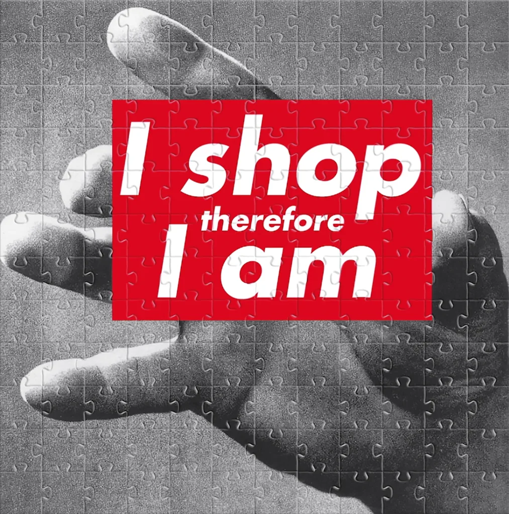
Red and white declarative text
Barbara Kruger, Untitled (I shop therefore I am), 1987
Attend to the high-contrast red/white pairing and how the text reads as both design and voice; in both cases, the phrase is the image’s main visual structure.
Shared red ground, white declarative text, quote-like address, graphic immediacy
Different Kruger uses boxed sans-serif type, more polished photomontage context, sharper geometric layout, institutional art framing
Image search
Barbara Kruger I shop therefore I am
mutualart.comformal echo
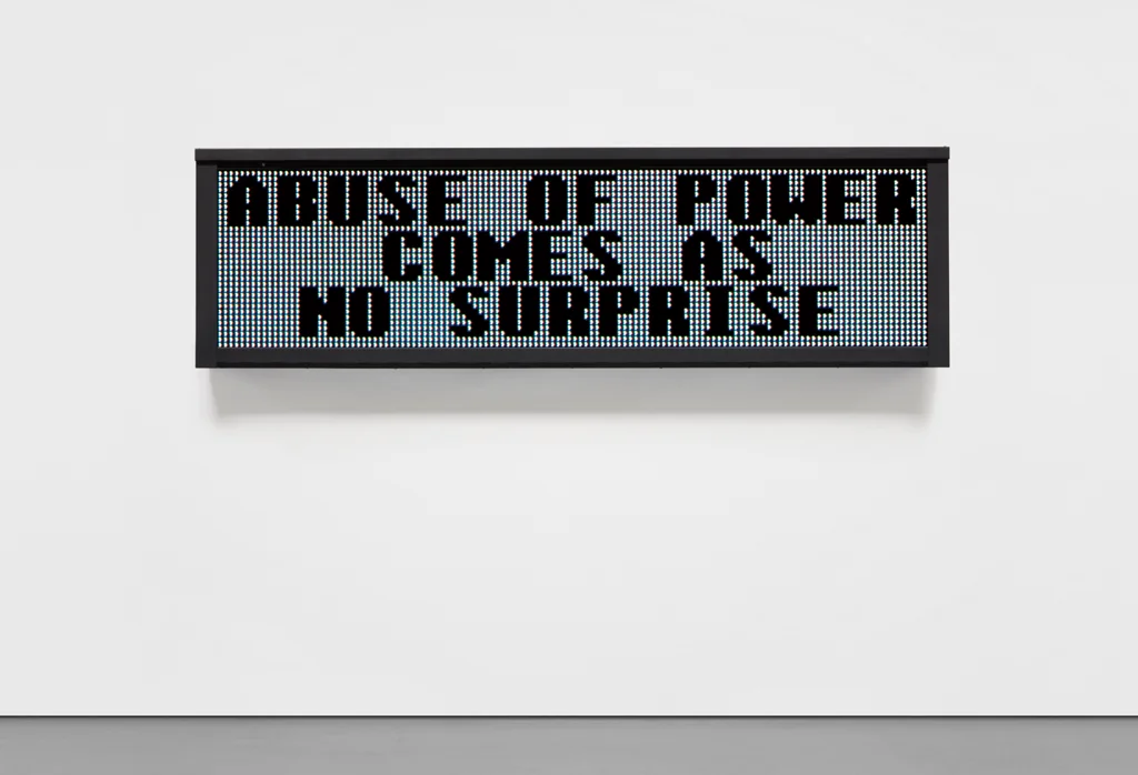
Public aphorism as artwork
Jenny Holzer, Truisms, 1977–79
Notice the aphoristic compression: the phrase is short, quotable, and structured to read quickly in a passing encounter.
Shared short aphoristic sentence, public readability, deadpan tone, language as image
Different Holzer often uses electronic signs or posters, more conceptual art context, typically sans-serif or LED typography, less tied to garment texture
Image search
Jenny Holzer Truisms LED sign
National 5 and 10typographic relationship
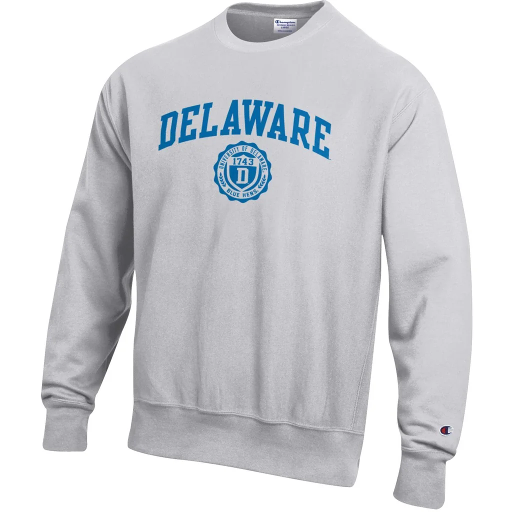
Collegiate apparel typography
Champion Reverse Weave collegiate sweatshirts
Look at the sturdiness of the uppercase letters and the way the text is meant to survive distance, movement, and fabric distortion.
Shared white print on colored cotton, uppercase apparel lettering, informal campus tone, screenprinted surface
Different reference often uses school names or arched layouts, heavier athletic letterforms, more symmetrical placement, less ironic verbal content
Image search
Champion Reverse Weave collegiate sweatshirt
StockXcultural lineage
Streetwear logo compression
Supreme red box logo, 1994 onward
Compare how a limited palette and a short typographic unit can act like a badge, turning clothing into a readable sign in public space.
Shared red-and-white graphic code, clothing as identity signal, compact text emphasis, street-level readability
Different Supreme uses a logo rather than a sentence, Futura-style sans-serif type, rectangular box composition, cleaner brand finish
Image search
Supreme red box logo Futura
myartbroker.comformal echo
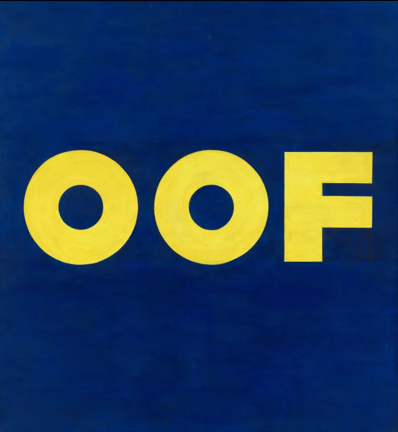
Text painting deadpan humor
Ed Ruscha, OOF, 1962/1963
Focus on the bluntness of the wording and the refusal of illustration; the visual event is the typography carrying a dry, comic voice.
Shared language-centered composition, deadpan humor, plain typographic delivery, minimal imagery
Different Ruscha uses painted canvas, more isolated word form, bolder color-field contrast, fine-art context
Image search
Ed Ruscha OOF yellow painting