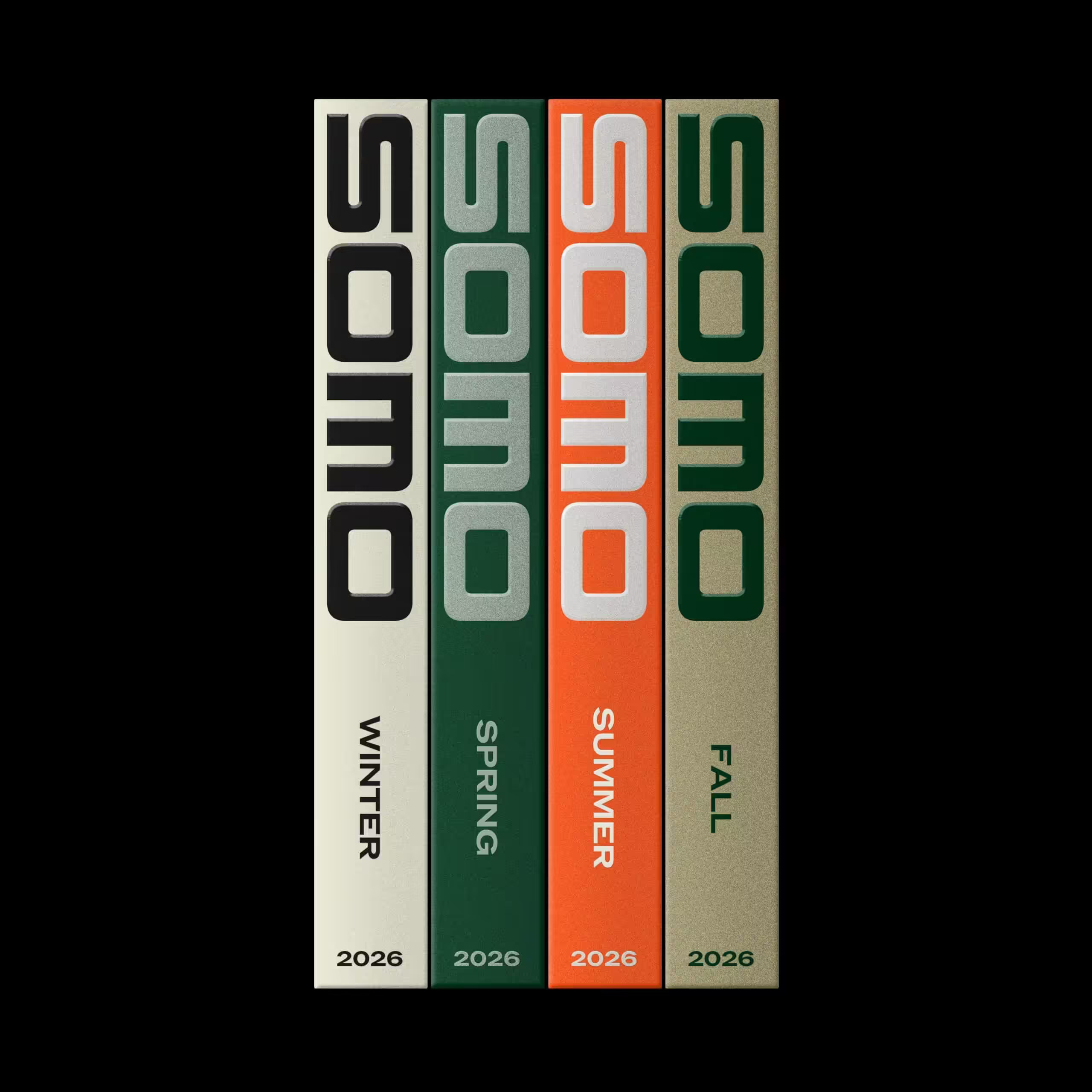
Seasonal Spines in Modular Type
A tightly centered stack of four vertical spines sits against a deep black field, giving the design the clarity of a catalog object or product mockup. The visual feel is retro-modern: chunky rounded letterforms, strict columnar alignment, limited seasonal color coding, and subtle paper grain. The composition relies on repetition and small variations—cream, green, orange, and taupe panels—with vertical typography acting as both label and ornament.
Visual index
Form rounded modular typographycondensed vertical letteringrectangular spine blocksgeometric countersbold stripe-like letterforms
Mood orderlynostalgiceditorialquietly premiummid-century influenced
Color cream and black contrastforest greenburnt orangemuted taupeoff-white inkseasonal color coding
Texture matte paper grainslightly speckled print surfacesoft ink edgesbook-cloth or coated-card impression
Composition four equal vertical columnscentered object on black groundrepeated spine formatstrict grid alignmentstacked vertical reading
Related images
thefoundrytypes.comtypographic relationship
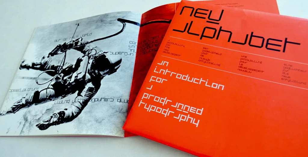
Wim Crouwel modular typography
Wim Crouwel, New Alphabet, 1967
Look at how Crouwel reduces letters to repeated bars, curves, and squared counters; the uploaded image similarly makes type feel architectural and systematic.
Shared modular letter construction, rounded geometric strokes, compressed vertical rhythm, letterforms as pattern
Different Crouwel is more experimental and less legible, the uploaded image uses warmer seasonal colors, book-spine product context
Image search
Wim Crouwel New Alphabet 1967 specimen poster
formal echo
NASA worm era corporate lettering
NASA logotype by Richard Danne and Bruce Blackburn, 1975
Notice the heavy rounded terminals and simplified curves, where letters become smooth industrial symbols rather than traditional alphabetic forms.
Shared rounded stroke geometry, 1970s graphic sensibility, high-contrast mark-making, minimal letter detail
Different NASA mark is horizontal, single-color institutional identity, more aerodynamic spacing
Image search
NASA worm logo 1975 red logotype Danne Blackburn

myreadingvintage.comcompositional relationship
Penguin paperback spine system
Penguin Books color-coded paperback covers and spines, mid-20th century
Focus on the way a simple grid, repeated logo placement, and changing color fields create instant category recognition across a set.
Shared series-based spine design, color-coded categories, vertical shelf presence, minimal typographic hierarchy
Different Penguin uses smaller classic type, more white space and emblematic branding, less experimental lettering
Image search
vintage Penguin Books color coded paperback spines
socks-studio.comcompositional relationship
Swiss International Typographic Style
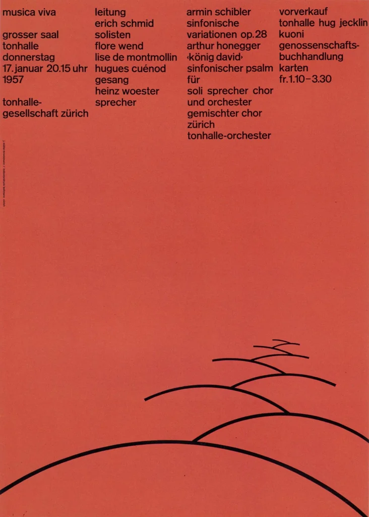
Josef Müller-Brockmann concert posters, 1950s–1960s
Attend to the exact column widths, consistent margins, and the way typographic placement creates order before any image-based content appears.
Shared strict grid discipline, controlled negative space, repetition with variation, typographic structure
Different Brockmann often uses asymmetric layouts, more austere sans-serif typography, less tactile paper texture
Image search
Josef Muller Brockmann Zurich Tonhalle concert poster grid
liveauctioneers.comperiod relationship
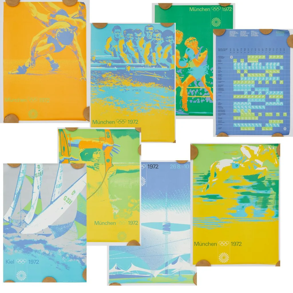
Otl Aicher Munich 1972 palette and systems design
Otl Aicher’s visual identity for the 1972 Munich Olympic Games
Look for the controlled palette, flat fields, and system logic: each variation belongs to a family while keeping a distinct assigned role.
Shared systematic color variation, modernist information design, flat graphic fields, modular identity logic
Different Aicher uses pictograms and sports signage, brighter civic palette, broader environmental identity system
Image search
Otl Aicher Munich 1972 Olympics color palette posters
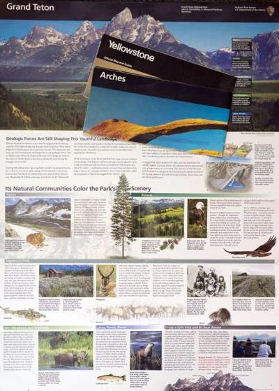
jhnewsandguide.comcultural lineage
Vignelli style publication systems
Massimo Vignelli’s grid-based book and identity design, especially the National Park Service Unigrid system
Notice how a simple set of rules can generate a family of related objects; the uploaded image feels like one slice of a larger editorial system.
Shared repeatable publication grid, limited typographic hierarchy, institutional clarity, series coherence
Different Vignelli systems are usually more informational, less decorative display type, more white-space driven
Image search
Massimo Vignelli National Park Service Unigrid brochures